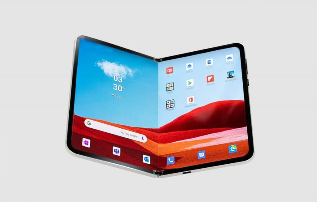
Microsoft's rumored move to a single screen foldable marks the beginning of the end of its third try at smartphone relevance.
The idea of Microsoft ditching its dual screen smartphone efforts for a less ambitious single foldable experience as a follow up to the Surface Duo 2 has been long rumored, however, a new Windows Central report has seeming put an exclamation on the notion.
While some friends and colleagues in the industry have moved on to accepting Microsoft's pivot as "the right call to make", I have selfishly stuck to denial, and that denial has turned to cynicism about the company's efforts.
Why it's the right move for the company
The Cost
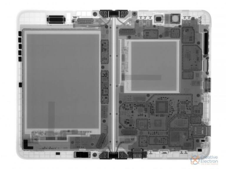
The Duo is an expensive device to manufacture. I'll refer to colleagues Shane Craig, Zac Bowden, Michael Fischer and Daniel Rubino who have gone on at length about the manufacturing hurdles Microsoft has to go through to source custom display panels for its unique dual 5.6-inch OLED screens with their 4:3 aspect ratio.
At first glance, using AMOLED glass panels that are already in production for most modern smartphones would seem like the fiscally responsible leverage for Microsoft when comparing it to the use of the relatively complex mix of polymer plastic and thin layers of Corning Gorilla Glass by Samsung and the Oppo Find N.
However, when it comes to scale, crowdsourcing the tried and tested foldable tech that is now in its 5th iteration saves more cents than forging a solitary path behind custom AMOLED displays.
In addition, to achieve the uncanny thinness of the Duo, Microsoft's also custom ordering other internals that include batteries, Wi-Fi antennas, and the hundreds of components that go into the famed 360-degree hinge.
If Microsoft truly wants the Duo to move beyond a reference device, it'll have to confront the reality of scale, and make a device that can leverage industry hardware and technologies in a timely manner.
The reality of Microsoft moving to a single screen design makes sense in the context of wanting to mass produce a piece of hardware on a schedule with supply chain reliability. With Microsoft moving to a more accessible design, the idea that it could manufacture its new phone for less should, in theory, result in a lower cost device upon sale.
Beyond recouping its sunk R&D cost at some point, moving to a single screen foldable screen experience is also a software relief for the company. While I've not experienced any screen lag, whatever computational magic is being performed to keep the dual screens synced, I would assume comes at a development cost that isn't present when calibrating a single screen.
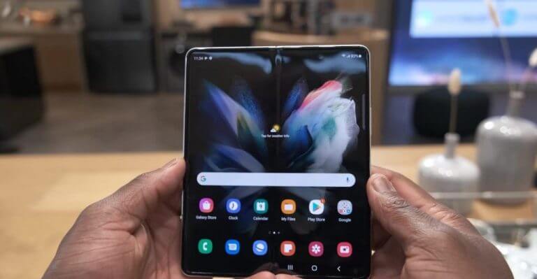
Following in Samsung's footsteps with a similar outer screen, 180-degree hinge, and single foldable inner-screen would afford Microsoft a bit more internal surface area to stuff possible wireless charging, larger camera sensors, and more battery into. I'm not saying they will do any of this, but there is a great possibility when utilizing the Fold design.
Use case
Lastly, Samsung has done a lot of the heavy lifting by educating the admittedly niche audience of foldable-curious users on how to handle the device in day-to-day use.
Coming up on its 5th generation device in 2023, the use of a Galaxy Fold style device seems intuitive and straightforward. Use the screen on the outside like you would a candy bar smartphone and open up the device to a more tablet-like experience when convenient. When it comes to snapping a quick photo, it's practically the same as it is on a Galaxy S or iPhone.
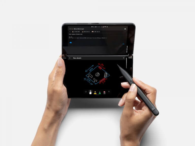
In stark contrast, the Duo comes off like a book, and most people don't know how to use books to take photos, make calls or navigate apps, at least not intuitively. The Duo takes getting used to, as well an additional level of confidence to use it folded over as a single screen experience.
Beyond the possible damage that can come from having both screens exposed, there is a software element to a single screen experience Duo users have to be cognizant of, which is accidental presses if the screen doesn't time out accurately.
Moving to a single foldable screen would alleviate all of these issues and presumably be the right move for Microsoft going forward, but it's not going to work out that way.
Why it's the wrong move for the company
Too little too late
Here is where my opinion differs from some of my colleagues when it comes to the proposed pivot by Microsoft to move to a Galaxy Fold style single foldable screen, I see it as too little too late.
For anyone who suffered the Windows Phone days, the phrase "too-little-too-late" stings a bit discordantly as it's something we endured for the better part of a decade, but this news of Microsoft's pivot to a new design in its third iteration echos a similar failed frame of thinking that's left product owners holding the bag numerous times.
While the Duo competed in the realm of foldable smartphone devices, it did so adjacently, and for all intents and purposes, at its own pace. Moving to a Fold-style design, Microsoft will compete directly with a device maker on its 5 generation of the design as well as one that's known for quickly iterating, getting better at software support, and has a well-established distribution channel.
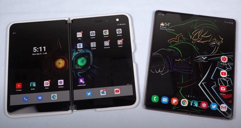
Yes, competition is typically a great thing, but not for Microsoft in this particular case.
Microsoft is ostensibly starting over with its R&D into its foldable smartphone offering and will undoubtedly run into its own fair share of first-generation issues that'll crash against the ongoing polish of its competitors.
Moving over to the polymer plastic design for the next Duo means having to devise protections for the screen in ways a simple AMOLED Gorilla Glass panel didn't require.
Cameras
Microsoft was knocked for its camera tech in the Duo in back-to-back years, but received acknowledgement of improvement the second time around, and was seemingly given a bit of grace on its performance due to its design. The level of thinness coupled with how to navigate the camera we both a negative for reviewers as well as acknowledgements of the company's vision for use of the device.
Moving to Fold-style foldable design will surface comparative desires to implement similar camera tech usually translating into more cameras and better performance, which, in theory, should be great for Microsoft. The problem I see here is that Microsoft will be working with new sensor sizes, and lenses, and it still hasn't perfected the image algorithms in its current design.
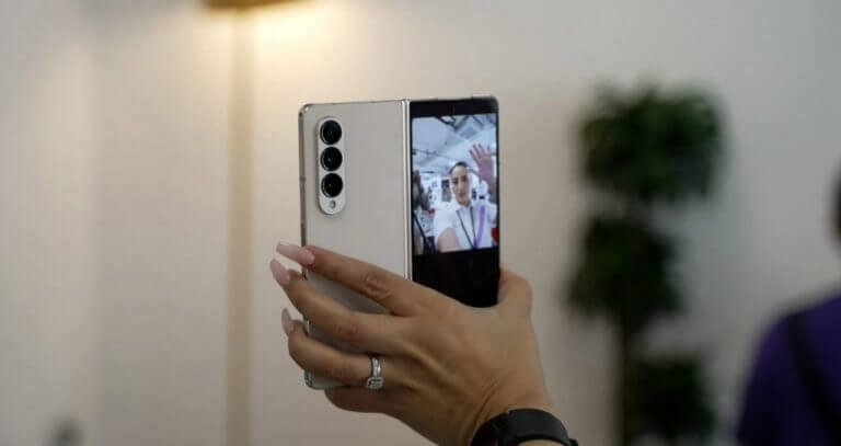
Google managed to squeeze amazing pictures from a single lens that protruded less than most modern camera sensors today through algorithms and computational photography. Samsung is getting the hang of these processes, but nowhere is Microsoft leading any product announcements with them.
While Surface computers do an adequate job of capturing images from both the front and back cameras, Microsoft's focus on image quality and computational photography seems to have disappeared with the Lumia team.
I say all this as a precursor for the inevitable camera reviews that will pile on top of the first-generation hardware issues and design choices people point to on Microsoft's third phone in potentially five years.
Competition
Microsoft initially sold the Duo as new type of handheld device, and with the Duo 2 it was still a new type of handheld device but one that could do more of the smartphone things people were used to, like taking great photos, using NFC to replace card payments, and better connectivity options.
With the Duo moving to the single foldable screen design, Microsoft is now saying this device is just like the other folding smartphones and it'll need to deliver the same level of experiences, just to be mentioned let alone compete, and the company has already proven several times over it hasn't been able to do that in mobile.
Software
The next reason this new single foldable screen design is a bad decision for Microsoft is one that's actually bad for the industry. Admittedly, Microsoft is siphoning off a sliver of a sliver of smartphone users with its Duo offering but in doing so, the company was also trying to push a boulder up a hill in getting developers to create dual app experiences.
Google has delicately been attempting to court developers to create better tablet experience for Android and have negligible results to show for it as a result, Google itself has invested very little support in app-to-app functionality such as drag and drop or multiple browser or tabbed instances.
Microsoft's Duo attempted a compromise that would allow smartphone users more app utility while buying Google more time to get its Android developers to adopt fuller featured UIs for their apps as the foldable market expanded.
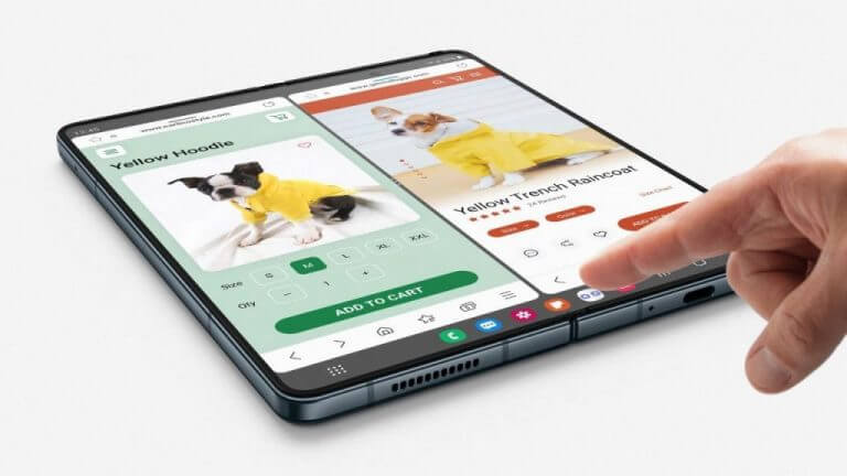
Evident by the plethora of reviews and anecdotal use case stories, using a Samsung Fold or Oppo N-Find results in single-app experience most of the time when using the expanded inner screen, despite the additional surface are, that'll result in the same blown-up app experiences Android users have had forever because the user behavior remains unchanged.
With two physical screens and, for better or for worse, a distinct division between the two, the Duo fostered dual app usage and more pronounced multitasking, by contrast, the Galaxy Fold seems to transferring the same single app experiences found on the outer screen to the inner screen. I'm afraid, with a similar design to the Galaxy Fold, Microsoft's next Duo will be sacrificing its multitasking for a series of similar single app experiences, even if it manages to mimic the screen dividing hinge from the first two Duo's via a digital partition.
Distribution
But perhaps the most prominent reason this new pivot from Microsoft to follow the industry's single foldable screen design is a bad move is because the company still doesn't seem to fully care about or understand the market.
I don't mean Microsoft doesn't understand hinges or foldables, but that it doesn't seem to understand accessibility, scheduling, timing, support, or distribution when it comes to smartphones.
Beyond the idea of crafting the perfect device at the perfect time, this third iteration of the Duo will be coming at least three years after its predecessor, in that time, Microsoft has done seemingly nothing to address its domestic or international distribution, warranty or customer support for smartphones.
It made the Duo 2 less accessible by parting ways with the single US carrier it partnered with for the first, it didn't reduce the unlocked cost of the device by much – both here in the states or abroad, it's buyback program to reward enthusiasts and early adopters remains abysmal, it's ecosystem incentivization is non-existent and marketing was a ghost town.
While pivoting to a design that might win you review points from people familiar with the use case, it doesn't cover up the gaping holes Microsoft has in delivering the device to customers. With the original Duo design, Microsoft could have maintained its aspirational position as being a reference device since no one else was making a device quite like it. It could skate on exclusive distribution because it was seemingly a unique device meant for a particular audience, akin to the first couple of Google Nexus devices.
However, crossing over into mainstream designs means producing mainstream experiences and Microsoft's mobile efforts just aren't built for that. For better or for worse, Samsung, Google and Apple have trained customers to expect a certain level accessibility to the product, either through carriers or subsidized financial assistance. Samsung, Google and Apple have also been increasing their ecosystem buy-ins with accessory devices such as earbuds, watches, cases, digital wallets, and more. Above all, Samsung, Apple, and even Google have also trained customers to expect timely updates for both hardware and software. Yearly, a device comes out, and monthly updates are distributed to older devices.
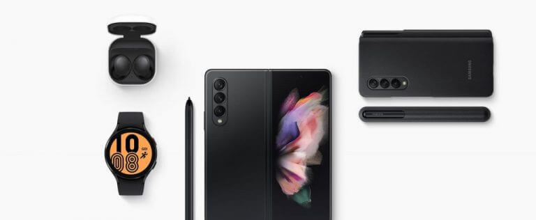
In 2023, Microsoft offers none of the above.
As I mentioned, Microsoft bought itself some slack with paving its own dual screen path despite being compared to single foldable screen devices. For what it was attempting to offer it got praise and for what it lacked, it got dinged. Being on a parallel path to more traditional foldables afforded Microsoft the time to find a convergence point for experiences, both in software and hardware in the future, while allowing it the freedom to distribute the device as it saw fit.
I believe this will be mostly undone by jumping into the fray of direct competition seemingly five to six years later than its new peers.
Be like the Surface Pro, not Windows Mobile
Analogous to 2-in-1's, Microsoft forged a path with the Surface Pro and while some OEMs initially tried, failed and pivoted to Yoga-style folding laptops, some are coming back around to testing the detachable waters after a proven track record of relative product success.
The Surface team tirelessly iterated on its detachable design, addressing customer and reviewer feedback each year about the Type-Cover, the hinge, the weight, camera placement, the size, the screen tech, connectivity support, port selection, battery and, more. What the Surface team didn't do was jump to the Surface Laptop year three of the Surface Pro's product lifecycle.
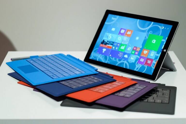
In its third iteration, the detachable Surface Pro found mainstream appeal as it got larger, thinner, settled on the Type Cover over the Touch, gained a more flexible hinge and got better battery life. In its third iteration, Windows Phone pivoted to Window 10 Mobile and we saw the beginning of the end as the company chased smartphone experiences being provided by competitors at a faster and more polished rate.
I could be wrong but this Duo pivot feels like the latter.
