According to a report from Italian Windows Blog, Aggiornamenti Lumia, a new sidebar filters experience is coming to the Microsoft Store. The experience is apparently only coming to US users and is being tested internally, with no clear date for a rollout to everyone else.
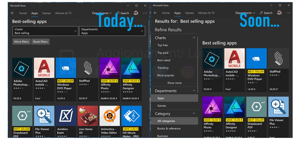
Anyway, the new sidebar filters experience removes the old tiled-style filter and drop down menu that usually appears when doing a search. It also looks more feature complete since it even comes with elements of fluent design. See a side by side comparison in action below, as done by Aggiornamenti Lumia.

A side by side look at the filter experiences (Photo from Aggiornamenti Lumia)
Again, it’s not clear if this feature will ever make it to the public, as it is being tested internally. Anyway, it definitely would be appreciated, especially after Microsoft completely revamped the store to make it look more like the web-based version. More will likely develop soon, and this might come to a Windows Insider build, so best to keep it tuned for more information.


