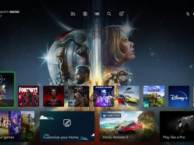
The long-promised new and improved Xbox Home screen wasn’t exactly a smash hit with the first set of Xbox Insiders who got to try it out early. While the updated Home screen was purportedly designed to be more personalized and user-friendly, certain design choices have not gone over well so far.
And the sentiment seems to be carrying over now that the new Home screen has started rolling out to the public. One big sticking point with users is that a “Browse the Store” button has replaced the “Browse my Games” one. This change seems to have been implemented in the last 24 hours—just as the new Home goes live for general users.
Why did they put the store button where the my games and apps button was?
by u/elsid156 in XboxSeriesX
The way this was implemented does seem questionable, and judging by the response online the move has proven quite unpopular. However, some in the Xbox Insiders Program have reported that this change has already been pulled back, so it will likely not be permanent.
Via Pure Xbox.


