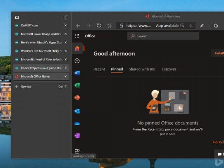
Microsoft Edge Insiders in the Canary and Dev channels can now try an early preview of a new Vertical Tabs feature. Instead of having all your tabs at the top of the browser, Vertical Tabs will move them all to a left panel, which should be really convenient for those of you used to keep lots of opened tabs in the web browser.
“Wide screens have become the norm over the last decade or so, but most websites are still designed with a narrower width that leaves unused space on either side of the content. Vertical tabs takes advantage of this unused space to show you more of your tabs without sacrificing how much content you can see at once. And with the ability to scroll through your tabs, you’re free to open as many as you want,” explained William Devereux from the Edge team.
To try Vertical Tabs, you’ll need to click the dedicated icon in the top left corner of Microsoft Edge. You can turn the feature on and off anytime you want, and you can also click the collapse icon to shrink the size of the vertical tabs pane. Favicons will still remain visible, and hovering your mouse over the left pane will display the full list of opened tabs.
Microsoft says that Vertical tabs should make it easier to reorder and manage multiple tabs at once or pinning your favorite tabs, and you can still mute noisy tabs by clicking on the speaker icon. The team will keep listening to feedback while the feature is in preview, and we hope to see Vertical Tabs land soon in an upcoming Edge stable release.


