Microsoft’s new Fluent Design System is definitely one of the most interesting announcements of this year’s Build developer conference. The new design language previously known as Project Neon has already appeared in several native Windows 10 apps such as Groove Music, Calculator or Contacts, and it seems that the Outlook Mobile app could be one of the next apps to receive the Fluent Design treatment.
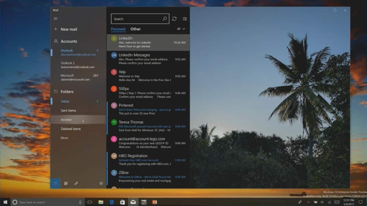
According to a report from Windows Central, during a Build 2017 session, Microsoft showed off an upcoming version of the app with Fluent Design. “The updated Outlook Mail client includes Fluent Design features such as light, for hovering over sidebar menus and items, motion with smooth animation when opening and closing certain user-interface (UI) elements, and acrylic for blur in some areas,” wrote our colleagues, adding that the new app also uses a “borderless” design.
You can see how it looks in the screenshot below:
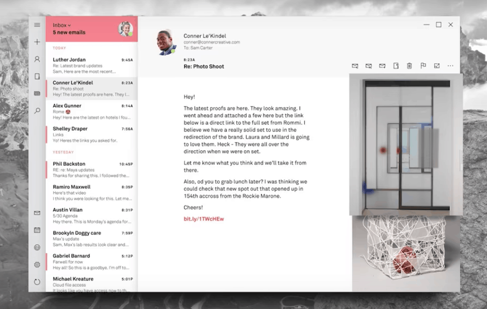
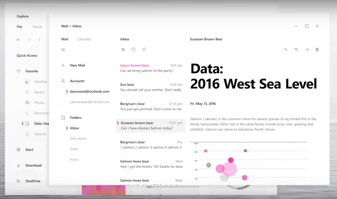
This new design is definitely an improvement over the current version of the app, but it’s possible that this isn’t the full story: if you closely watched the Fluent Design System video that Microsoft shared yesterday, you may have noticed that two images of an even better-looking email app appeared very briefly. It’s not clear if these were just mockups or a glimpse of what Microsoft has in the pipeline for the Outlook Mobile app.
The first image below, which appears at 0’57 in the video looks quite similar to the current Outlook Mobile app. However, there are more buttons on in the left menu bar, and it seems that Microsoft also toned down the transparency effects in this one.
This second image, which appears at 1’00 looks quite different than anything we’ve seen on Windows 10 so far. We’re no designers, but this looks like flat design pushed to a whole new level.
Again, these two images could well be mockups to just illustrate all the possibilities with Fluent Design. As Microsoft explained, the new design language is much more than blurring and transparency effects: Microsoft wants to give developers clear guidelines to create UWP apps that are more intuitive and engaging, and the first Fluent Design elements that we’re starting to see in select Windows 10 apps is hopefully a taste of things to come.
Do you like the upcoming version of Outlook Mail that Microsoft showcased during this Build session, or do you prefer the other concepts that appeared briefly in the Fluent Design video? Let us know what you think in the comments below.
