The October 2018 Update, version 1809, is the latest update for Windows 10. Set to start rolling out to all Windows 10 devices this fall, new features like the File Explorer dark mode and SMS integration in the new ‘Your Phone’ app will become available to everyone. Countless little things have been added and refined all about the OS, however, some stand out more than others. Today we’re going to be exploring the most remarkable changes.
Your Phone on your PC
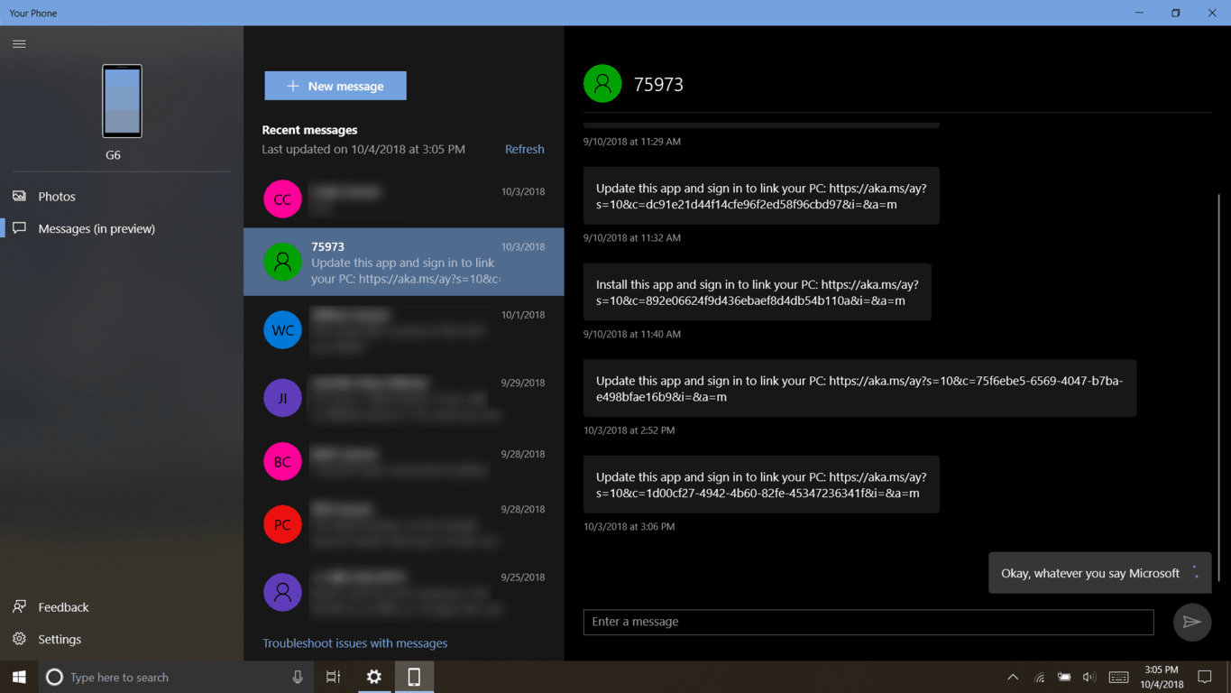
With the “Your Phone” app on Windows 10, and “Your Phone companion” on Android, you can access your phones photos and text messages right from your PC!

Once you have the October 2018 update, open the “Your Phone” app on your PC. Here, instructions will guide you through connecting your phone number to your account. Then, you’ll get a text message on your phone to download “Your Phone companion” from the Google Play store. At this time, only Android devices running Android 7.0 and above are supported. Due to restrictions in iOS, iPhone users will have to sit back for now.
“Your Phone” has two sections: Photos and Messages. Photos lets you view or copy the most recent pictures taken on your phone. Texts can be sent through your phone from your PC in Messages. Keep in mind this feature is still in preview, so it might be a little quirky. Currently, you can only view and send text, but new functionality is coming soon.
Dark theme in File Explorer
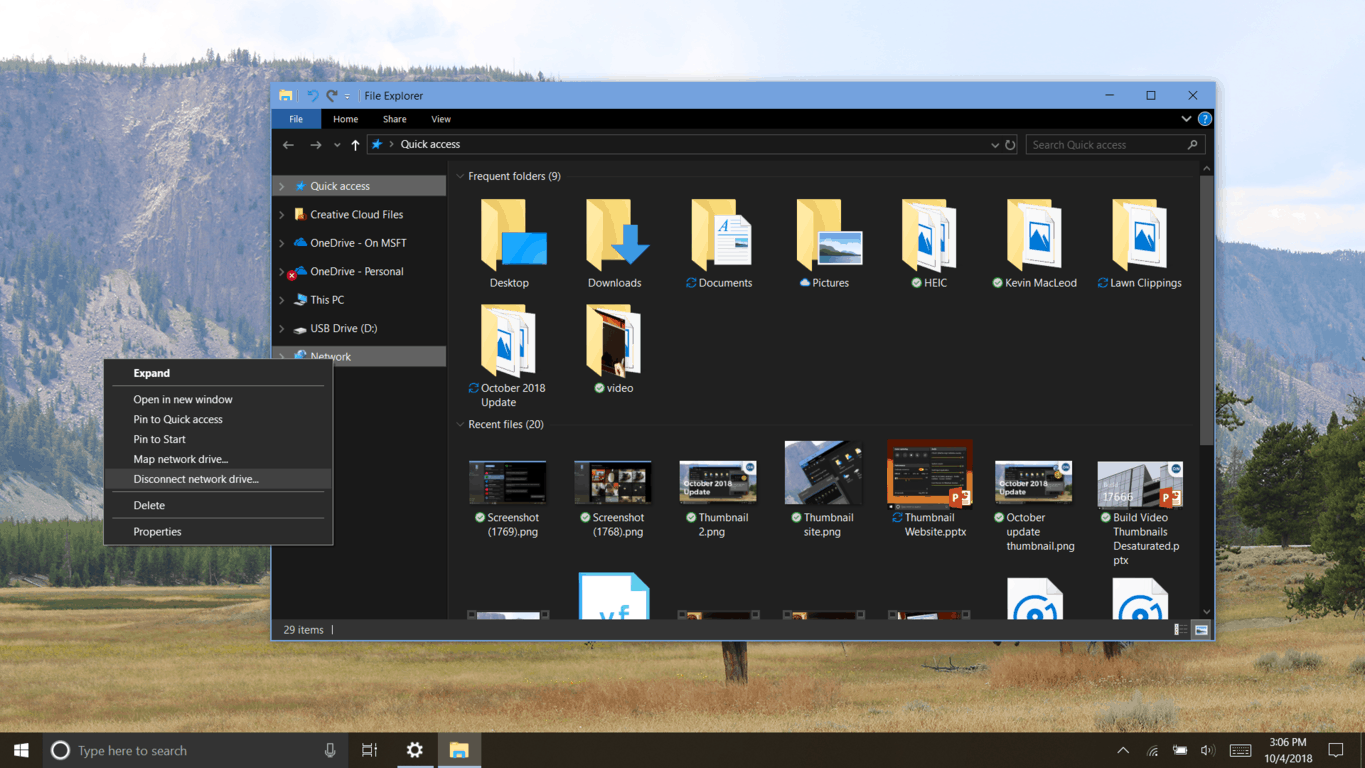
A dark and light theme has always existed in Windows 10. While having a dark desktop is a great option, dark theme in Windows 10 still looks somewhat AMOLED-centered. Dark theme also doesn’t extend much further than UWP apps, which can be frustrating for many people.

In the October 2018 Update, the File Explorer is finally acquiring support for the dark theme. It looks exactly the way File Explorer in Windows 10 always has, only, dark. As a veteran dark theme user, I can only be grateful for this, however, I can’t help but nitpick. The overall execution of dark theme across Windows is poor; an opinion re-enforced by the recent introduction of a dark theme in MacOS Mojave. On its first move, Mojave appears to have magically gotten the concept pristinely materialized systemwide. Windows 10, on the other hand, has had a dark theme for 3 years and exceptions are still the norm. This seems to be the case with just about every aspect of Windows 10’s design.
As I’ve said, however, this is just nitpicking. I can look through these small inconsistencies to the overall experience, which in concept is actually really good. Windows 10’s design language manages to create an understandable, accessible, and elegant solution to the device-type spectrum we see today. Despite this, even through the musty glass, it’s harder to ignore the deeper issues.
A truly terrible tablet mode
When things don’t work as intended, the design language is more difficult to realize. Timeline is a part of Task View. The unusually poor performance it exhibits in this update just makes Tablet mode more difficult to use than before. Similar features are standard on MacOS and Chrome OS. It’s a must-have on laptops, and essential on tablets.
The touch keyboard is another essential aspect of Tablet mode. Has it been overhauled in the October 2018 Update? Yes. Is it still awful? Absolutely. SwiftKey integration makes touch typing a lot better, but this is figuring you’re even able to get the keyboard to open in the first place.
It’s not all bad though. Many of the worst bugs plaguing Tablet mode when Windows 10 was first launched no longer exist. SwiftKey integration only shows that Tablet mode isn’t suffering from complete neglect. Remember that Microsoft is selling Surface Pro without a type cover, so it would be in their best interest to have an alternative input method that works
On a positive note, Windows 10 now aligns with Unicode 11, supporting an additional 157 new emoji.
Snip & Sketch, your new Snipping Tool
The October 2018 Update is also revitalizing many older features in Windows 10. A lot of people lost it when they heard Microsoft is updating the Snipping tool with better support for pen and touch. I think they would be shocked to learn the snipping tool was designed specifically with tablets in mind. The first version of the app dates back to Windows XP Tablet PC Edition.
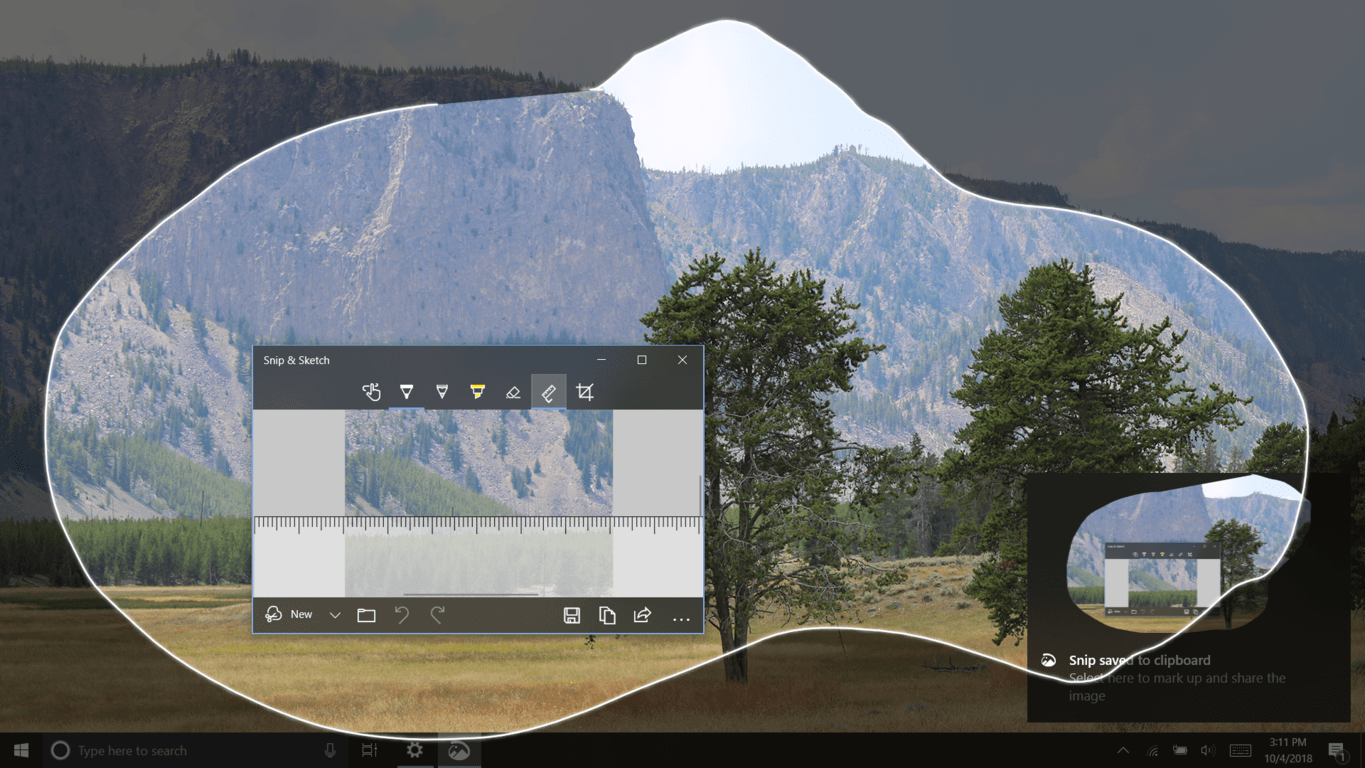
The Snipping tool is being replaced by a new app called “Snip & Sketch”. The controls are extremely simple. You can create a new snip by clicking the highlighted button in the corner. The screen will dim out, and you’ll be free to take a snip. You can also switch to rectangular, free-form, or full-screen snips in the toolbar near the top of the screen. As soon as you’ve taken asnip, it will appear in the Snip & Sketch window. Here, you can mark up your snip using the standard Windows ink tools. Inking feels a lot more natural in this version, and the tools are far more customizable than before. The pencil, ruler, crop tool, open file button, and undo options are all features that didn’t exist in the old app. The only (and pretty major) feature missing from the new app is a Window Snip option.

There are several new ways to enter snipping mode too. Using the keyboard shortcut Win+Shift+S, you will be taken into snipping mode automatically, and your snip will be copied to your clipboard. There is a shortcut in Action center, or you can configure the clicker on your pen to activate snipping mode (my favorite). For keyboard users, a toggle in the Windows Settings will allow you to enter snip mode by hitting the print screen key, useful if you only want to copy a specific part of your screen. A notification will let you know you can edit it at any time by tapping on it.
For now, the classic snipping tool appears to be sticking around, but it makes sure to let you know that it probably won’t be for much longer.
A new clipboard
Huzzah! A completely new clip-boarding experience is being introduced into Windows 10, but don’t worry, your classic commands and context menus are completely unaffected by these changes! In addition to CTRL+C and CTRL+V, the new shortcut WIN+V will bring up a clipboard panel wherever you are typing. This new clipboard saves multiple items, in chronological order, allowing you to clip and paste sporadically to your heart’s content. The items in the list can be clicked on or selected using your keyboard. Should you want to destroy all evidence of your blasphemy, however, the clear all button is your saving grace.
Additional ways in which you can customize the clipboard can be found in the Windows Settings. Here, you can enable the contents of your clipboard to sync across all your devices, which may consist of the entire thing or just specific items. Here, you can also just disable the clipboard entirely because you hate Windows 10 and will never use the Windows Settings.
Clipboard history currently only supports plain text, HTML, and images less than 4MB. This limitation doesn’t apply to your local and most recent clip, as always.
Windows Search
Windows search can sometimes be hit and miss. For me, it doesn’t understand “Snip and Sketch” and “Snip & Sketch” mean the same thing, all the while insisting on opening the Snipping tool instead. This aside, there are some nice new things to be found here.
Searching for apps, documents, or files now brings up an extended preview with helpful shortcuts and information regarding that result. If I search for PowerPoint, the preview pane will have shortcuts to recent PowerPoint presentations. Searching for a file or document will show you where exactly that file is located, which you can copy or open.
Finding quick web results is also easier, as Cortana processes your text as you are typing, showing you an answer without needing to hit enter or wait for a result to load. I can just type “What time is it in Korea?”, and the answer is right there.
Microsoft Edge as a document reader
Remember when Windows had its own PDF reader? Those days are long gone. Windows 10 uses Microsoft Edge for PDF and eBook viewing and does quite an outstanding job.
Reading view is a feature that makes web pages more comfortable to read. Seemingly aimed at young learners, the October 2018 update comes with Learning tools in Microsoft Edge. When you highlight a word, the definition will appear automatically. You can have the pronunciation of that word spoken, and also given are example sentences. Learning tools can help in various other ways. You can space the text out a bit, change its color, and even enable a line reader to focus on sets of one, three, or five lines at a time. Grammar tools can be downloaded from the Microsoft Store, further assisting in text comprehension by highlighting nouns, verbs, and adjectives and different colors. Larger words can also be broken up into their syllables, to help with pronunciation.
A redesigned settings page is present in Microsoft Edge in this update. Settings are categorized much better than before, and even contain new options like media autoplay.
You’ll get the update eventually
There are many other new features in the October 2018 Update. An updated Game bar, Bing integration in Notepad, autofill suggestions in the Registry Editor, new wireless display projection controls, and so much more. Most of these things simply work towards making existing features in Windows work better, and that’s a good thing. While Tablet mode is still abysmal, and things are still pretty damn inconsistent, in the end, the positive changes in this update outweigh the stagnation that exists. Stagnation you’d worsen by avoiding it… but let’s face it, you’ll eventually have this update whether you want it or not.

