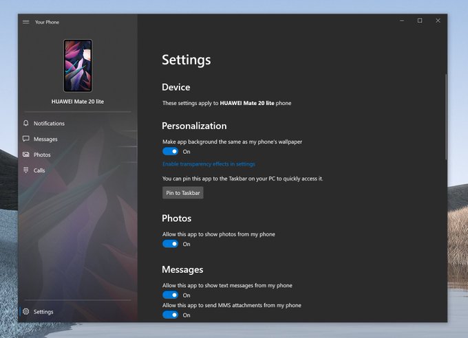
Microsoft, yesterday, released some notable design tweaks for the Windows 10 Your Phone app, though these changes seem to be only available for select Insiders on the Slow Ring (via WC). First of all, there’s a new circular button for composing new messages at the bottom of the messaging screen, which replaces the existing “New Message” button which was rectangular in shape. It now features a blue circle containing a “+” symbol, making better use of the Microsoft’s Fluent design guidelines.

Credits: WC
In addition to the new button, Slow Ring Insiders have noticed a minor change in the dark mode, as Your Phone now has a cool show shadow effect, making the interface a bit lighter. Aggiornamenti Lumia highlighted the fact that the app now features a gray tint of the dark mode, rather than a plain black background.
Again, for anyone interested in these latest design improvements, you need to be enrolled in the Windows 10 Slow Ring to get the chance to see them. However, it shouldn’t be long before this update starts rolling out to the rest of the Windows 10 userbase.


