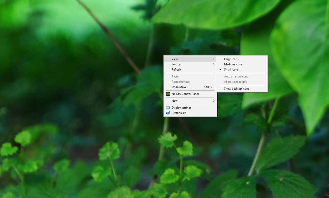
Let’s face it. Windows 10 has had a mix of different context menus all throughout the operating system, causing one to scratch their head and asking “why are these context menus not the same in terms of design?” For example, right clicking the taskbar shows of a different context menu compared to right clicking the desktop or right clicking in the Edge browser. Here’s how it used to look in older builds of Windows 10:
Pick a menu, ANY MENU… AND STICK WITH IT PLEASE. pic.twitter.com/kjZl85se0h
— Zac Bowden (@zacbowden) July 11, 2015
Microsoft has taken it to the Insider Hub on Windows 10 to explain a few things, citing your feedback as the reason why Microsoft has made improvements to the context menus.
“You asked us to pick a menu and stick with it, and we heard you loud and clear. We want to share a snapshot of where we are today thanks to our design/engineering teams, and of course our Windows fans. Keep in touch and let us know what works (and what doesn’t). Consistency is tricky when you have menus built using different frameworks and principles, so we went back to the drawing board with questions that needed answers.”
The biggest problem had to do with different development teams building different menus for Windows 10. To fix this, Microsoft simply brought everyone together and agreed on principles and design direction — including size, color, touch-friendliness, etc.
Further reading: Microsoft, Windows 10


