Store updates on Windows 10 PC & Mobile, dumps accent color & moves menus

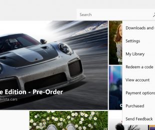
A significant updated has begun to roll out to the Windows Store on all Windows 10 PCs and mobile devices that changes the look quite a bit. With the new update installed on PC, the Windows Store now lists the logged in user in a separate location next to the main drop-down menu across the top of the app (see above image). On Windows 10 Mobile devices, the account options are still listed within the main menu however a new account icon has been added to the top-right corner. This is seemingly done to make the ability to switch accounts more prominently displayed.
An arguably bigger change to the Windows Store, and one that could frustrate some users, is its new ignorance of the system’s custom accent color. Previously all of the Microsoft apps (and some select third-party apps) and buttons within the Windows Store were displayed with the chosen system accent color but now both the buttons and app icons are a basic blue.
Do you like these changes? What would you do differently? Let us know in the comments.
Further reading: Apps, Microsoft, Windows 10, Windows 10 Mobile, Windows Store


Do you like the changes?