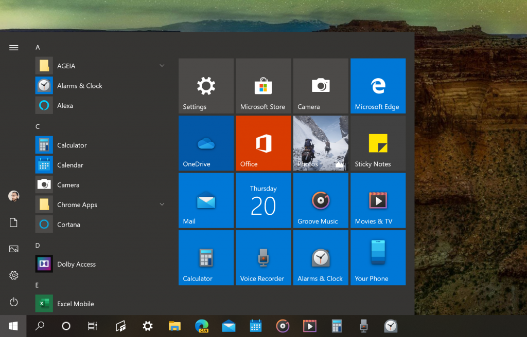
Microsoft has started rolling out new colorful icons for its Windows 10 inbox apps to Windows Insiders (via Aggiornamenti Lumia). Apps like Calculator, Mail and Calendar, Alarms & Clock, Movies & TV, and even Groove Music are now getting the new icons, which we’ve already seen in the Windows 10X emulator that Microsoft released last week.
Microsoft teased some of these new Fluent Designed-inspired icons back in December, and at the time Jon Friedman, Corporate Vice President, Design & Research at Microsoft explained that his team was working on redesigning over 100 icons with new colors, materials, and finishes.

As Microsoft is currently working on a new Windows 10X OS created for the ground up for dual-screen devices like Surface Neo, the design work that Microsoft is doing on the new OS should hopefully benefit Windows 10 users. The various inbox apps on Windows 10 will also run on Windows 10X, and Microsoft is making sure that they will look good on dual-screen devices.
Windows 10 users have been complaining for years about design inconsistencies across Windows 10, but it looks like the company is slowly but surely getting its act together. Friedman previously explained that a “cross-company design collaboration” was going to bring us dark mode experiences across Microsoft 365, and a same cohesive push for Fluent Design now seems to be flowing across the company.


