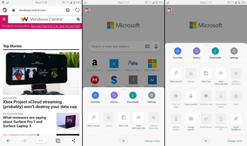
Microsoft is testing a new redesigned UI interface for the Android version of Microsoft Edge. The refreshed design brings rounded corners in some areas of the app such as the URL bar, and a new hub menu to allow users to access their bookmarks, history, downloads, and general options, according to Windows Central’s Zac Bowden.
The new hub brings square tile icons in place of the traditional list entries of the current version of Edge on Android, likely to make it easier to use on touchscreens. Microsoft has also made them customizable, so users should be able to add and remove options they don’t need.

Image via Windows Central.
The new update seems to be limited to A/B testing right now, so it’s likely only a small handful of Android users will be able to try the new interface for themselves. We haven’t seen anything about iOS yet, but considering Microsoft is pushing hard for its Edge browser efforts with Chromium-baked version coming soon, hopefully we’ll see something soon.
What do you think about the new UI changes and new customizable hub menu? Let us know in the comments area below.
Further reading: Android, Microsoft, Microsoft Launcher


