Ever since its big rebrand, Microsoft Launcher made its way to the top as one of the most popular launchers on Android. Thanks to its integrations with Cortana and even Windows Timeline, the launcher is the ideal solution if you’re a Microsoft fan.
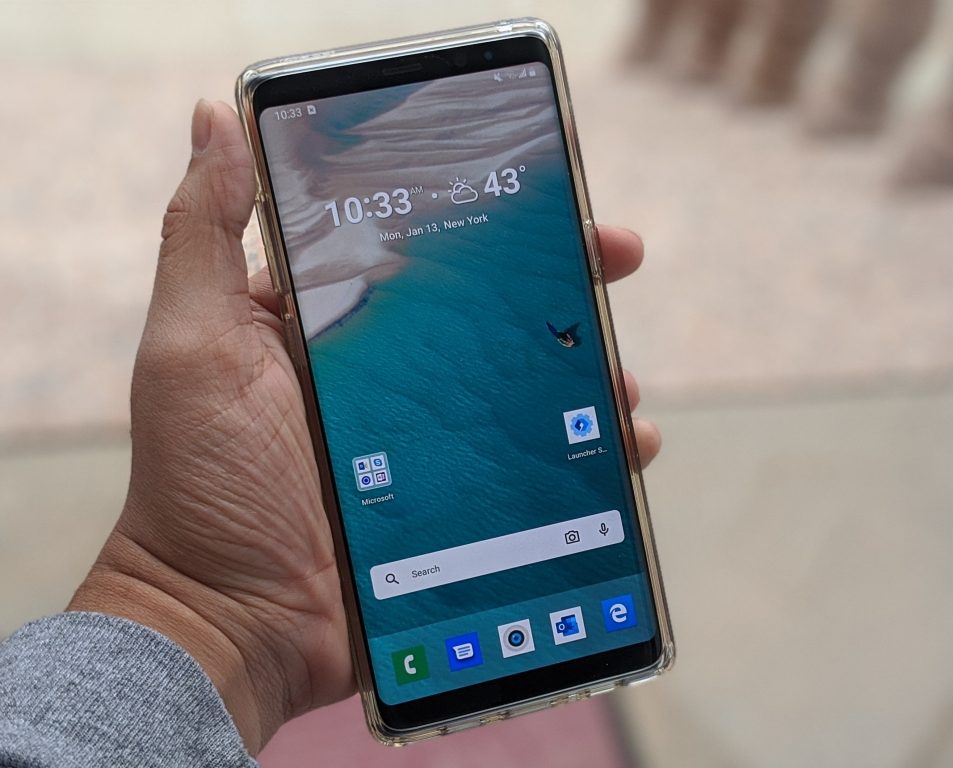
With the incoming Holiday 2020 launch of Microsoft’s first dual-screen Android phone, the Surface Duo, the company has now released an improved version of its Microsoft Launcher. Coming in at version 6.0, this version is available as a separate download, and it will likely power Surface Duo later this year. From the new landscape mode, revamped dock, and improved light and dark themes, it is quite different from the regular Microsoft Launcher experience on Android. Here’s more on what you can expect when downloading it.
A new landscape mode
The biggest change with this preview version of Microsoft Launcher is the new support for landscape mode. This is something that wasn’t available in previous versions of Launcher, and it works just as you expect. Now, when you rotate your phone, the launcher will rotate with you. You’ll be able to see both your home Screen and the activity area in landscape mode. The dock will move to the right side of the screen, and you’ll get an almost tablet-like experience, which might presumably be similar to the one that we might get with the dual-screen Surface Neo.


A new dock
Another big change in this new version of the Microsoft Launcher is the improved dock. A bit similar to the one on older versions of macOS, the dock is now much more front and center. It’s slightly taller and more square and looks exactly like the one we saw when Microsoft teased Surface Neo. Unfortunately, though, it does look like this early preview has removed the options for the quick settings toggles in the dock, as pulling up on it now just shows apps, rather than toggles for airplane mode, brightness, or Bluetooth. This is expected, as the launcher is currently in Alpha, which means you won’t be seeing all the features available in the regular Microsoft Launcher.

Improved light and dark themes and Glance screen
The third improvement in Microsoft Launcher Preview is improved light and dark modes. The light mode now has a different look to it, and when paired with the transparency effects, it essentially resembles the one that was previously introduced in Windows 10 version 1903. The dark theme also sees the same improvements and looks very similar to the Windows 10 dark mode as well.
These light and dark theme improvements are all best displayed in the Glance screen, which you get by swiping to the right. In this area, you’ll notice your profile icon at the top of the screen, similar to what we know the Windows 10X Start Menu will look like. The search bar has also moved so that you need to “pull-down” on it to show it, and even the cards in the Glance screen look different. They now have a more rounded look, and the names of the cards themselves no longer appear inside the card but are floating on top, giving it a cleaner and slimmer look that lets you peek to the background.

A look at what’s to come with Surface Duo
After playing with this preview version of Microsoft Launcher, there’s quite a lot to be excited about. Sure, the changes are small, and there are some bugs in this release, but from the redesigned dock or the improvements to the glance screen, Microsoft is clearly giving things a fresh coat of paint. Ahead of the release of the Surface Duo, this is your chance to help shape the future of Microsoft Launcher by sharing your feedback about new features work. You can take part now and download the Microsoft Launcher preview via the link below.


