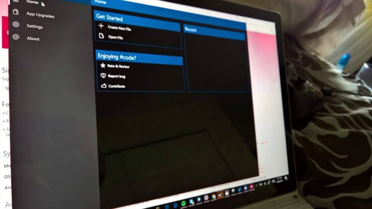
Creating an application can be a challenging task. Even more challenging can be tuning it to make it accessible for everyone. Not everyone can use their fingers or eyes as well as others. Making an application that has a wide array of ways to use it not only increases their experience but your own.
The Windows Dev blog released a helpful blog post today that gave tips and tricks on ways to make your applications more accessible. Some of these are so minor as including legible text sizes to the most overlooked habits of labeling colors for the colorblind. Below is a summary of the blog’s tips:
- Implement a screen reader such as MS Narrator – Provide UI elements that can be read when the user cannot read it themselves.
- Add keyboard interactions – Make your application able to be navigated with more than just gestures. Use tab and arrow buttons to let users switch between UI components.
- Audio descriptions – Describe colors, elements, titles, and other parts of your UI for visually impaired or illiterate.
- Use a high contrast theme – Make text and UI have very noticeable differences in color.
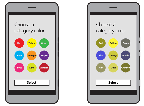
- Add visual cues to elements – Using text or light texture designs to indicate important information will help those that are colorblind note the difference easier.
- Always add Zoom – A basic for many readers that might need to read your text or see your images. It’s important in this case to use Vector images instead of Raster images so that they stay crisp and clear.
Of course, user customization is the key when deciding upon a theme, color, or size. If you let users decide these options for themselves, the accessibility will be able to adapt to multiple scenarios. This can take care of most of the above settings.
As a developer that doesn’t want to customize your own automatons, it’s probably your best bet to reply on Microsoft UI Automaton instead. Supporting accessibility that way can almost guarantee basic requirements for your audience without as much hassle.


