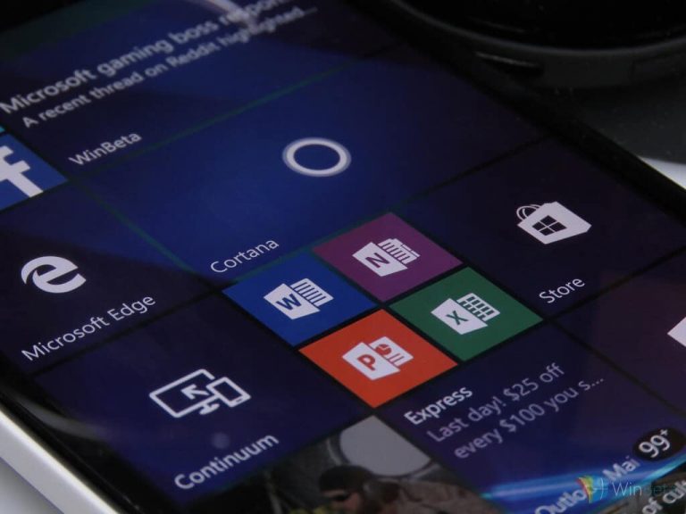
With the success of the Windows Insider program, Microsoft now lets anyone give them formal feedback through the Feedback app. In this series we break down some of the most intriguing feedback and suggestions. We’ll do our best to dive into the lists of feedback rather than just have “dark theme everywhere.” This week we look at Windows 10 Mobile.
Note that the links to feedback items work by opening the Feedback Hub in Windows 10 Mobile.
While Windows 10 Mobile isn’t very popular, it is, at least in my opinion, a great operating system. It runs well on low end hardware, it has a growing set of integrations with Windows 10 PCs, and its layout and design match its PC/tablet counterpart. It also has a large set of features baked directly into the OS that are quite impressive.
While I’ve had some flirtation with Android, that had nothing to do with the OS as a whole. Things like the app gap can’t be fixed with a magic wand by Microsoft. What Microsoft can do is continue to improve Windows 10 Mobile by making it feature rich and well designed. They’ve done a great job in my opinion when it comes to the actual operating system. There are also plenty of features and improvements on the way.
That being said, there are some things that us feedback givers would love to see jump onto the OS. This week I went through some of the most popular feedback for Windows 10 Mobile that wasn’t tied to a specific app. Many of these relate to Live Tiles but there are some other good bits of feedback as well.
Swipe up to restart
This is a great piece of feedback that would add functionality without having to move anything else out of the way. When you hold the power button, you can slide down to power your phone off. While you occasionally have to turn your phone off for things like planes taking off, almost every time I turn my phone off it’s to reset it. Adding a simple swipe up gesture would make this just a bit faster.
Easier customization for the Action Center
The simple drag and drop design of Live Tiles is a big plus. It makes customizing your phone really easy. Microsoft has improved how users can rearrange the tiles in the Action Center but you still have to do it through the Settings app. This feedback calls for that same simple drag and drop method to come to the Action Center.
More Transparent Lives Tiles
If you ask just about any Windows 10 Mobile user what they like about the operating system, I’d bet Live Tiles are in their top 5. They’re unique and let you make your phone feel like more of a part of you. There are plenty of apps that support Transparent Live tiles, both third party and Microsoft made. This feedback calls for Microsoft forcing Transparent Live tiles for every app. I don’t think that’s wise but the sentiment behind it makes sense. What I would like to see is all of Microsoft’s first party apps having a transparent tile option.
Make use of the whole Live Tile
Much like the transparent Live Tile feedback, this calls for Microsoft to better utilize a feature within their first party apps. Some third party apps, like Tweetium for example, make excellent use of the entire live tile. When someone mentions me on Twitter, Tweetium shows a profile photo and the tweet all on one Live Tile. In contrast, the Messaging app only shows one line of the text message and doesn’t use the senders image at all. Microsoft can make some big improvements when it comes to using their own features and Live Tiles are a big area to improve.
Close all apps option
This one is pretty straight forward. As you use your phone throughout the day you build up how many apps are on in the background. Being able to somehow swipe them all away at once would be great. This feedback also calls for greater control of how much apps close when you swipe them away.
Tall and wide Live Tiles
Awhile back insiders were teased with the large tile and the tall tile on Windows 10 Mobile. The large tile is already on the PC and tablet versions and would fit right in on mobile. It would be especially benefitted on screen layouts that are 4 live tiles squares wide so you could have two large live tiles side by side. The tall Live Tile that this feedback calls for would requirement support from developers but would fill out Start Screens nicely.


