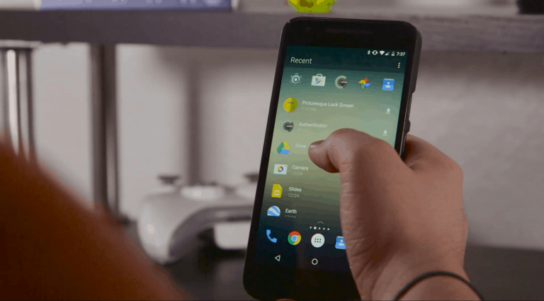
Arrow Launcher is one of a series of Android apps that have been launched by Microsoft and has been pretty warmly received so far. The app creates an improved home screen for Android devices that lets users cut through all of the fat, and have only their most valued apps and contacts front and center at any given time.
A new update has come to Arrow Launcher recently that demonstrates Microsoft’s commitment to keeping it in working order, and it brings with it some solid improvements to performance, along with tweaks and some other goodies.
Here’s the changelog:
- [FEATURE] You asked, we delivered — material animation for App Drawer.
- [ENHANCEMENT] Improved the UX for adding an app to the Apps Page.
- [ENHANCEMENT] Added back the App Info button.
- [ENHANCEMENT] Added back pagination for the Widgets page.
- [PERFORMANCE] Improved app launching speed by 20%.
What you see is what you get here – nothing that’s all that fancy, but it’s a sizable tweak to a well-received app. Android users should be more than pleased to see that Arrow Launcher has been tuned up to better fit their needs, especially with clearly visible quality of life improvements like new animation and an improved user experience. The re-addition of the App Info button and pagination for the Widgets page should also be a breath of fresh air, allowing users a bit more flexibility and clarity while they use Arrow Launcher.
For users who find themselves appreciating the under-the-hood changes that the update has to offer, that last performance enhancement in the way of a 20% launching speed increase should be very exciting. Often times, when running a third party home screen of any kind, users run the risk of subjecting themselves to a somewhat slow and under-optimized experience. Thankfully, Microsoft’s dedication to polish and high quality software carries over to their work on Android, and delivers an improved Arrow Launcher for anyone who wants a clear and concise home page.


