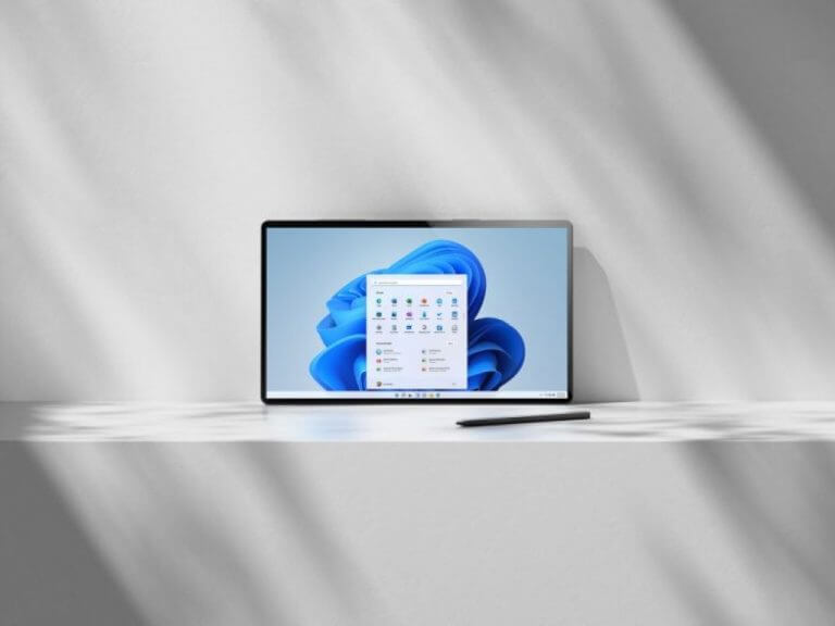
There’s no doubt that Windows 11 is visual improvement when compared to Windows 10, but there’s still more to come for the next-generation Microsoft operating system. Spotted by Windows Latest, Microsoft is apparently “rethinking” the approach to Fluent Design in Windows 11, so it can better be implemented across more of its apps.
This was discussed by Microsoft’s Kevin Gallo in a 28-minute long Windows Developer Q&A session on YouTube. At around the 20-minute mark, Gallo mentioned that Windows 11 features a “mica” design element, which allows a blur of the desktop background in the title bar whenever an active window is open. This can help incorporate the theme of the system more into menus as well, but also improve system performance because it only blurs the image once, compared to Fluent Design’s acrylic effects.
Overall, the video offers a good look at what developers can do to incorporate new elements of Windows 11 into their apps. Gallo mentions how this is a priority for Microsoft, and he also gets into other tech giant’s design languages such as Google and Apple. Give the video a watch and let us know your thoughts in the comments below.


