It’s no secret that a design revamp for Windows 10 could be on the way. Panos Panay teased this in an Instagram post, and later, we saw some of that come to life with a tweaked Start Menu in a Windows Insider build. But that’s not all. It appears as though Microsoft could once again be teasing a modern File Explorer in Windows 10.
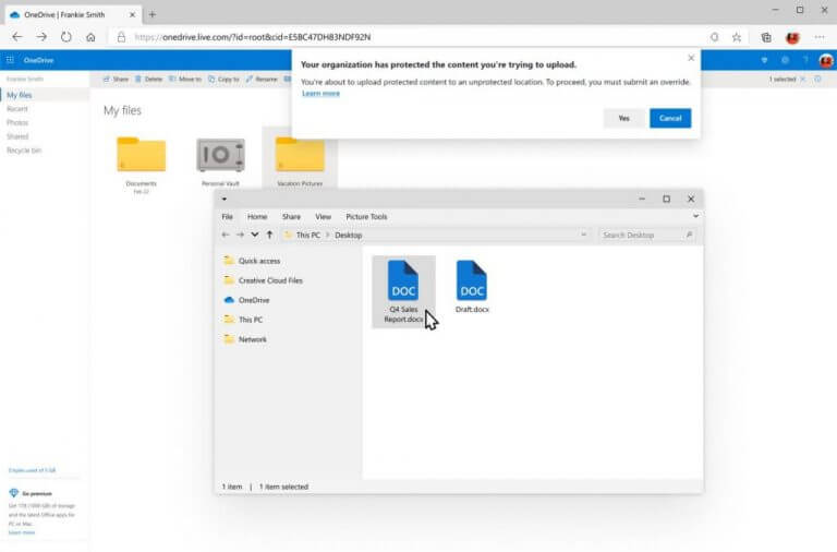
In a post on the Windows Experience blog today, Microsoft included an intriguing image when describing the Endpoint Data Loss Protection of Microsoft Edge (seen in our featured image above.) We can see a photo of Edge warning about protected content being uploaded, but we can also see an open window of what could be a modern File Explorer underneath.
It is true that this could just be an internal mockup or just a OneDrive File Picker, but it still appears to be pretty fluent, nonetheless. We see a cleaner sidebar in this File Explorer which is more consistent with the design of Windows 10’s new iconography. There are also slimmed down and cleaner tabs in the top for File, Home, Share, and View. This File Explorer also appears to drop out the title bar, and icons at the top.
Again, we’re not certain that this is the modern File Explorer, but we did find it pretty interesting, to say the least. As we argued, Windows 10 is currently in desperate need of a new coat of paint, especially when it comes to the File Explorer. Compared to the macOS Finder, the Windows 10 File Explorer looks a bit dated and bulky.
Asides from Dark Mode support, the Windows 10 File Explorer hasn’t been updated much since Windows 8.1, and it has no support for tags or tabs. Even a third-party app like Files UWP looks much better than Microsoft’s own Windows 10 File Explorer.
This is all still enough to start a discussion, too. Do you think Microsoft is teasing the modern File Explorer? How would you improve the File Explorer? Let us know in the comments below.


