When Microsoft unveiled the Surface Book 3, it did so to an arguably mixed crowd. Some fans and users applauded the relatively modest updates to the powerhouse productivity machine, while others were expecting more significant changes to a seemingly aging product design.
While redesigning hardware constitutes a financial and labor-intensive process that has to account for a multitude of known and unknown factors for most companies, crafting a well-designed mock-up may only take a few hours, and in some instances help to guide actual change if popular or conceptually holds merit.
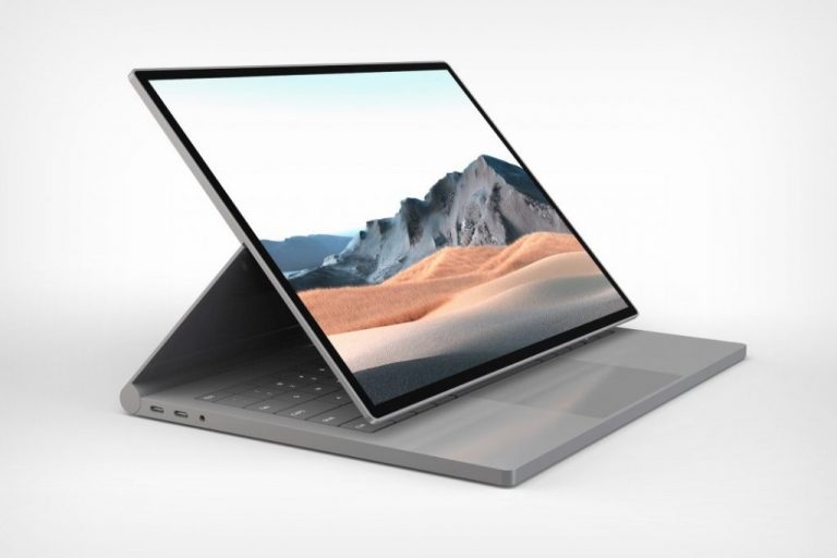
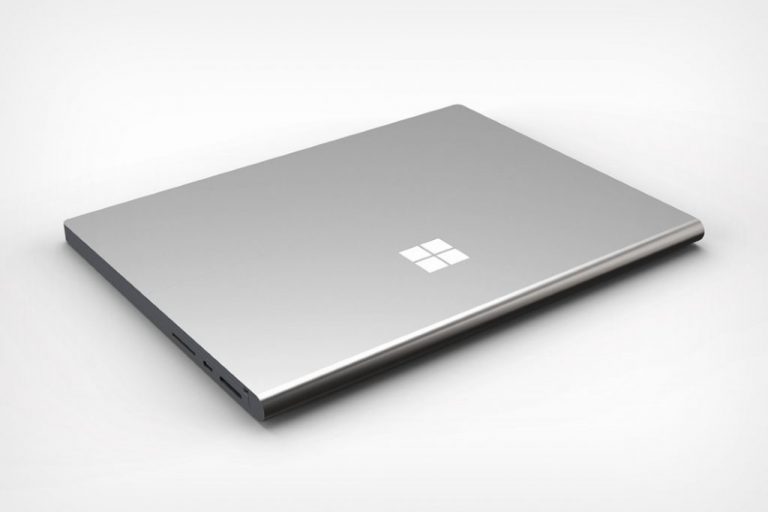
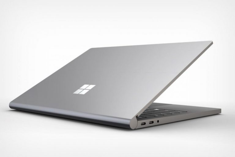
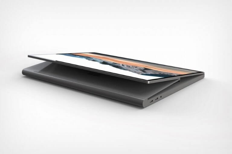
Enter designer Ryan Smalley, who has conceptualized the Surface Book into a solid-state convertible rather than its historical two-piece 2-in-1 design. Picked up by Yanko Design blog, Smalley’s work is given a spotlight to showcase what a possible Surface Book 4 or later could look like if Microsoft took the reigns off its current hardware design.
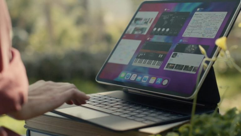
Perhaps taking some inspiration from the latest iPad Pro stand design, Smalley’s concept keeps the infamous “clipboard” part of the Surface Book permanently attached to the device, oddly betraying the original intent of the computer’s detachable design. However, in exchange for the portability a detached clipboard offers, there’s a dual hinged screen apparatus that arguably offers a more functional drawing experience for most.
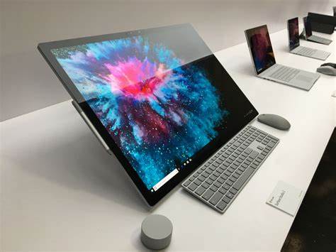
Removing the knee-jerk comparison to the iPad Pro’s latest keyboard stand attachment, what some could see is the evolution of the Surface Book into mini Surface Studio, ala Surface Pro to Surface Go. Smalley’s hinge design actually mimics more of the Surface Studio’s tilted screen than it does the iPad Pro as the entirety of the screen obfuscates the keyboard and puts the screen front and center of the experience.
For some, Smalley’s design might be easily dismissed as illustrated fanfiction, but there is a level of consideration that should be in this particular concept as it does address several pain points discussed by current and former users of the Surface Book. First of all, Smalley’s dual-hinge design eliminates the current software-based detachable hinge mechanism in place, removing any possible software-related lock-ups, charging, bricking, or wonky display issues during re-attachment.
Secondly, the design moves the guts of the machine back into the base, allowing Surface designers to play with thinness and bezel designs which could catch the screen up to industry standards. Lastly, it moves the headphone jack back to a reasonable position. While most people are going Bluetooth with their headsets, many still rely on wired headsets to churn out hours of work and the current placement of the audio jack on the Surface Book line is simply ridiculous.
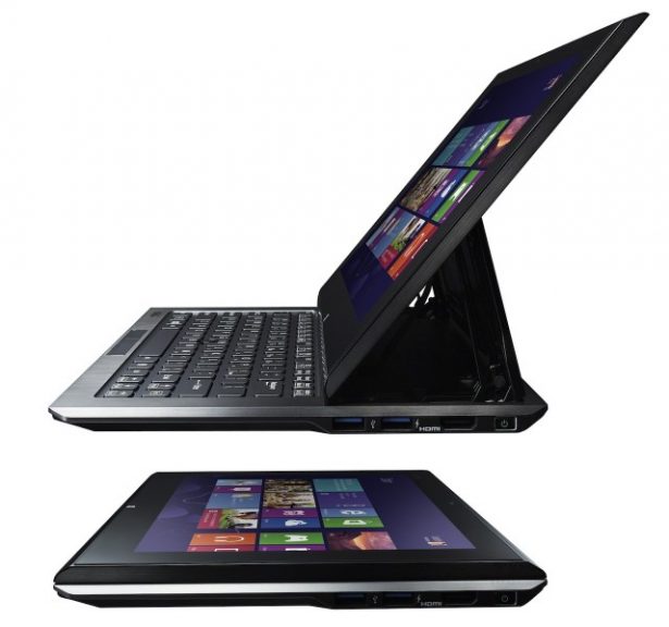
Of the many concept designs that have floated around for the Surface Book, Smalley’s is arguably one of the best ones. The design leverages other attempts by OEMs in the past such as the Sony Vaio Duo 13 or the Dell XPS 12, but packages the entire thing a neatly crafted and uniquely Surface-like design language.
Microsoft is unlikely to drastically change course on their Surface Book hardware design, but if they ever plan to, head of Surface hardware Panos Panay may want to give Smalley a call.


