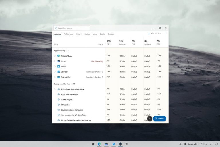
Other than the Taskbar and Start Menu, one of the core experiences in Windows is the Task Manager. It’s gotten minor design changes over the years but has remained relatively the same with a boxy tabbed-based interface. A new concept, though, is completely reimagining the Task Manager and gives it a fresh modern look (via Twitter.)
As seen in the featured image above, this concept looks to be inspired by Fluent Design, with a twist of Windows 10X. Seen running on top of a Windows 10X-looking Taskbar, which has centered icons and a redesigned system tray, the Task Manager is very different from anything we’ve ever seen before. The concept drops out the heavy Windows 98 styled boxes around the tabs in Task Manage for clean text with an indicator line underneath.
There is also a new search box in the top left corner to allow the user to search for a specific task or process to kill. The menu on the top of Task Manager is also gone and instead is replaced with a button along the top to run a new task. You even can find a “…” submenu, similar to the one in the new Microsoft Edge.
Elsewhere, the list of processes and apps is also much cleaner and drops the heavy backgrounds for a cleaner look. There’s even a clear blue icon to End a task, and a button to scroll the list up and down.
Of course, this is just a concept, so it is likely never to come to reality but is very cool, to say the least. We’ve seen a lot of these concepts as of late, and most are inspired by Windows 10X. They range from the battery meter and the Action Center or Start Menu. There even was one that gives Windows Update a complete overhaul.


