Since the fold of Windows Phone, Microsoft seems to be a bit mushy on its design principles for its various properties. For better or for worse, Windows Phone ushered in a time of concerted focus on the part of Microsoft’s design teams across multiple platforms. The Office, Windows, VM, and even Server teams had to implement Windows Phone-inspired UI changes to their software and services.
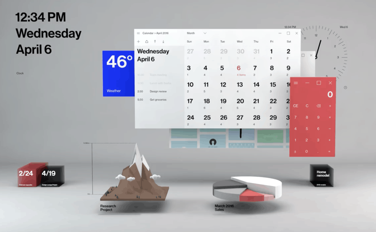
The short-lived Windows Phone experiment, for all its faults, helped Microsoft organize and stick to a UI paradigm. With Windows Phone in the rear view, the company seems guided by a loose set of design philosophies that often don’t translate across platforms.
With that being said, a new Microsoft intern by the name of Michael West would like to dig back into the bag of Windows Phone tricks to help the company modernize its apps for mobile, starting with Edge on iOS and similar concepts for Android.
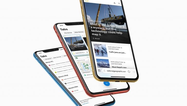
On his website, Michael West, under projects, is his latest design mock-up of what Microsoft’s Edge browser could look like when a little time and consideration is applied.
West’s approach is simple and pays a nod to Samsung’s One UI while also honoring the original intent of Windows Phone.
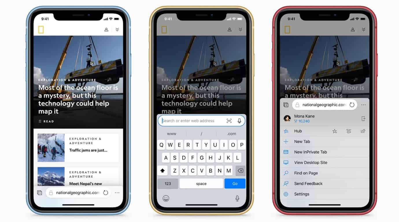
This new design for Edge mobile places an emphasis on usability. All navigation controls are located at the bottom of the screen.
West’s several render mock-up highlights a search bar that becomes embedded in the keyboard of choice on mobile and puts any altered search queries within reach of most users than at the top of the rendered web page.
Another thing West would like to emphasize is for his proposal is a more concerted effort to implementing tab syncing across devices and even operating systems now that Edge can be downloaded to macOS as well as Android.
More importantly, West would like to call upon Microsoft designers to implement some more UI flares that could include a similar design aesthetic to iOS and could see the inclusion a drop shadow, layers, and new animations.
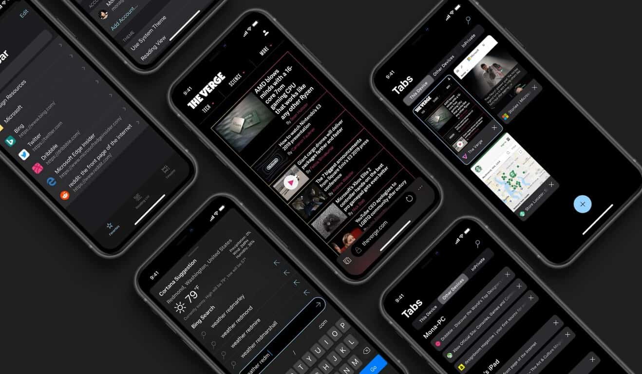
West also covers the potential for better Ink support for iPad within the Edge app, more menus, settings, and warranty offerings as well as a refined dark mode that adheres more to the grey pantones rather than the current jet black on the launch of the home screen.
There are countless mock-ups of new UI efforts armchair designers would like to see Microsoft follow, but there is only one Michael West who has some the design acumen and the access to Microsoft to see it become a possibility. Hopefully, this note won’t go unnoticed by the company while it works to refine the new Edge experience.


