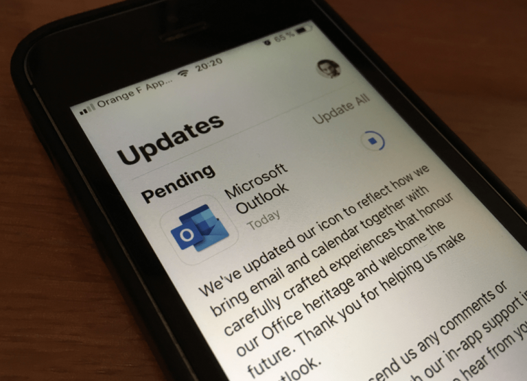
Microsoft’s Outlook app on iOS is the first Office app on the platform to get the redesigned icons that Microsoft unveiled a couple of weeks ago. The new Outlook icon is actually superposed on a white background, and the result is something that looks quite similar to other iOS apps like Gmail (most icons for Google’s iOS apps also use a white background), or Microsoft’s own To-Do app.
This latest update doesn’t seem to bring any changes other than the new icon. The last major update for Outlook on iOS happened back in January, when the version 3.0 introduced a new blue header and an improved scheduling experience. A dark mode is also in the pipeline, though we still don’t know when it will be ready for the public.
Outlook is one of the most-frequently updated Microsoft apps on iOS (especially if you’re a beta tester), and it’s also one of the best email clients on the platform. This new icon should make the app really stand out on your home screen, and we’re now looking forward to see the redesigned Office icons continue their propagation across all platforms.
Update March 20: This latest update also brought Office Lens functionality to Outook for iOS. By clicking the camera button when you compose an email, you can quickly capture documents and even draw on them.
Office Lens has come to @Outlook for iOS! ???? Available now in the latest update. Capture documents and whiteboards with magic. ✨ You can then easily draw on them too to make notes… or just have fun making doddles. ???? pic.twitter.com/LRkIaS0nlz
— Michael Palermiti (@MPalermiti) March 20, 2019


