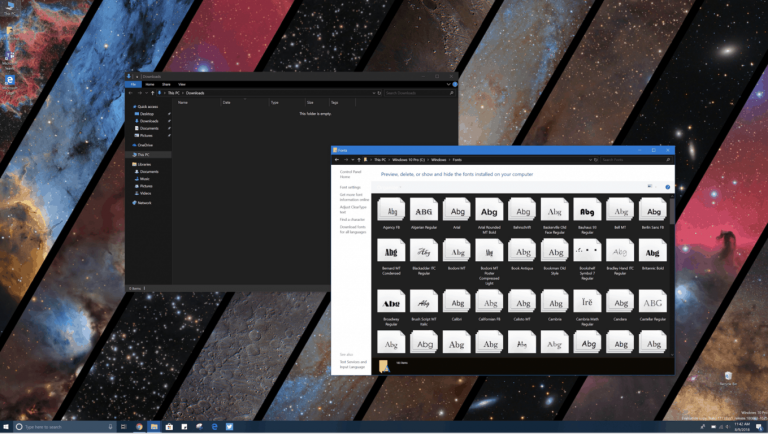
Following the release of Windows 10 Insider build 17733 yesterday, Windows Insiders in the Fast Ring can now discover the additional work Microsoft made on its new dark theme for File Explorer. “We’ve finished what we set out to do for this release,” the team said in yesterday’s blog post, suggesting that the new dark theme won’t get any more improvements before the next major update for Windows 10 ships this Fall.
A lengthier blog post about Dark Theme in File Explorer was also published on the Windows Insider website yesterday, and it explains how feedback from Insiders helped Windows engineers create this latest version. Still, it wasn’t long before some eagle-eyed Insiders started pointing out the various inconsistencies in this new Dark Mode. Unfortunately, it looks like you can still encounter white windows in a lot of places, including the legacy Control Panel, the Folder Options pop up windows, and many more.
Dark Theme support in File Explorer is complete in 17733 – RS5.
Erm, I guess we just brush these other views under the carpet?@WindowsInsider #WindowsInsiders @zacbowden pic.twitter.com/wZ7PFgXgE1
— Martin Anderson ???????? – mdtaUK (@mdtauk) August 8, 2018
https://twitter.com/WithinRafael/status/1027408966010122240
Make no mistake, we’re glad that Microsoft is finally implementing dark mode for File Explorer (it has been a top Insider request for a long time), and it’s certainly not a trivial task to implement a dark theme for all these legacy components of Windows. Still, the average Windows 10 user seeing all these white windows on top a dark File Explorer won’t see anything else than a flawed execution.
It’s easy to rant about all the persistent design inconsistencies in Windows 10 (especially the lack of a common design language for Microsoft’s own stock Windows 10 apps), but the Windows Insider blog post from yesterday tried to explain all the challenges that Windows engineers faced. And as it turned out, the team needed to be very careful when tweaking the Windows Shell with some dark touches to avoid “breaking a lot of app experiences.” You can get more details below:
Compared to modern parts of Windows, File Explorer was a whole different beast. While dark mode can be applied to modern XAML components in Windows quite easily, File Explorer contains legacy UI frameworks which don’t plug into that infrastructure automatically. With File Explorer, we were literally breaking new ground to provide a dark theme to legacy parts of the shell. We also needed to be careful to only change File Explorer (and the Common File Dialog) and not change common controls generally, which could break a lot of app experiences (such as making dark text in an app unreadable).
The Windows Insider team didn’t say if it’s planning further improvements for dark File Explorer in a future Windows 10 update, but we’re not sure if the current implementation deserved to ship with the Redstone 5 this Fall. Microsoft previously showed that it had no issues with delaying new features such as Timeline or Windows Sets, and we guess it will all depend on feedback from Windows Insiders.
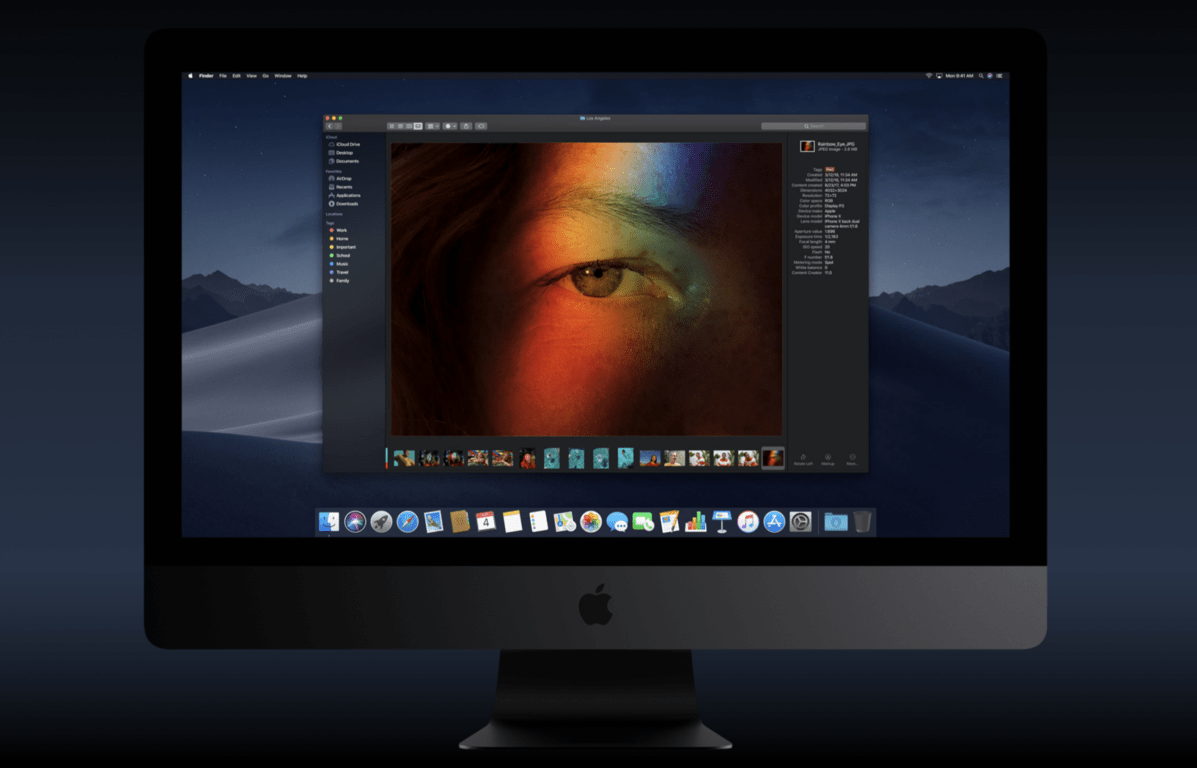
Dark Theme support has been a core Windows 10 feature since the beginning, but it’s still a work in progress. Once again, Microsoft had the right idea since Windows Phone 7 (the execution was also much better back then), but its competitors are now catching up. This Fall, Apple will bring a dark theme option to macOS Mojave, and it looks more polished than what Microsoft has done with Windows 10 over the past three years. And remember that Apple develops macOS behind closed doors, unlike Microsoft who proudly says that its Dark File Explorer has been “designed by Windows engineers and inspired by Windows Insiders from around the world.”
Do you think the current implementation of dark theme in File Explorer is ready to ship to all Windows 10 users, or do you think the various inconsistencies could damage Microsoft’s reputation? Having a dark File Explorer probably isn’t the most important thing Windows 10 users care about, so maybe Microsoft should wait to find a way to apply dark theme to all legacy Windows components. The company made a lot of efforts over the years to get rid of the “Microsoft has no taste” stigma, so it would be really unfortunate to get burned over another design faux pas later this year.


