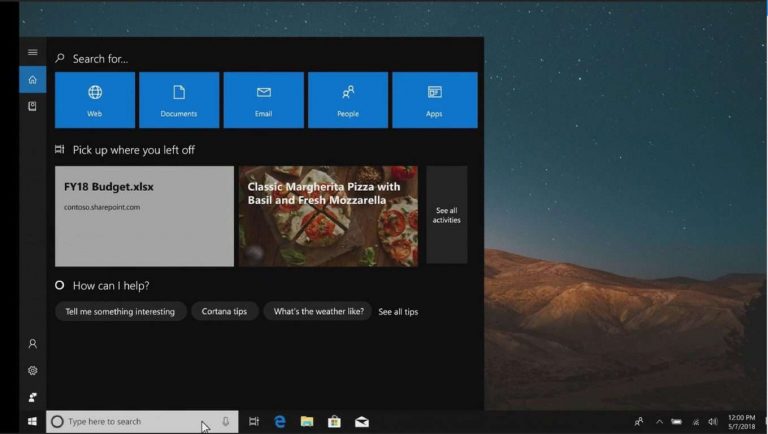
On stage at Build 2018 today, Microsoft’s Joe Belfiore teased an idea for a redesigned Cortana UI on Windows 10 which he said will come soon to an Insider build. Like the many experiences showcased today, the new Cortana UI is inspired by the power of the Microsoft Graph. It also is designed to be more proactive and make more relevant suggestions based on the frequency and intensity of what you worked on.
As seen in the featured image above, this new Cortana is significantly different from what is seen in current versions of Windows 10. The UI is much wider, and there are tiles running along the top for web searches, Documents, Email, People, and Apps. There are also tiles in the middle which show some top proactive suggestions for Windows Timeline, and a section on the bottom for Cortana’s usual tips.
This is rather interesting, and it is not the first time that Microsoft has considered a Cortana redesign. As you may recall, registry hacks in Redstone 4 build showed that Microsoft was looking to make Cortana much more like macOS Spotlight, though things never came to be.
We’ll be looking forward to hearing more about the redesigned Cortana soon, but for now, it’s nothing but a tease. Feel free to check it out for yourself by visiting the replay of today’s keynote and going to the 12-minute mark. Let us know in the comments if you like this redesigned Cortana.


