With Microsoft recently admitting that Windows 10 Mobile is dead, fans of the mobile platform have had to deal with the sad fact that their devices will never see featured updates or big touches of Microsoft’s new Fluent design system. Designer Marko Malinović is now giving Windows Phone fans a look at what could have been, showing off his concept of a beautifully reimagined version of Windows 10 Mobile, even complete with Fluent Design all across the mobile OS.
Malinović’s concept takes the features and UI elements Windows 10 PC users have been accustomed to and blends it into his own version of Windows 10 Mobile. He calls it a “reimagining Fallen Knight” and a “mixture of fundamentals that came to life in 2010 and today’s standards in graphics and interface design.”
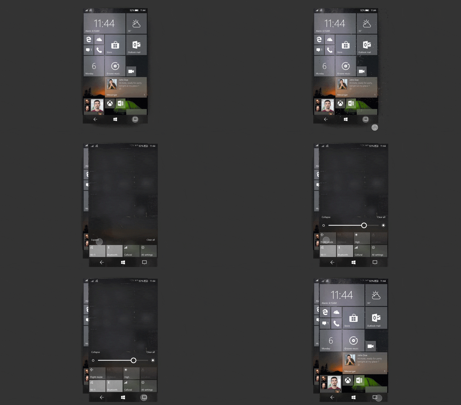
On the Start Screen, the concept is heavy on Acrylic design, bringing an acrylic finish to Live Tiles and the on-screen navigation buttons, making them easier to see. Interestingly, it also replaces the search button with Action Center, helping it make it “useful, easy to access, and consistent with the desktop version of Windows 10.”
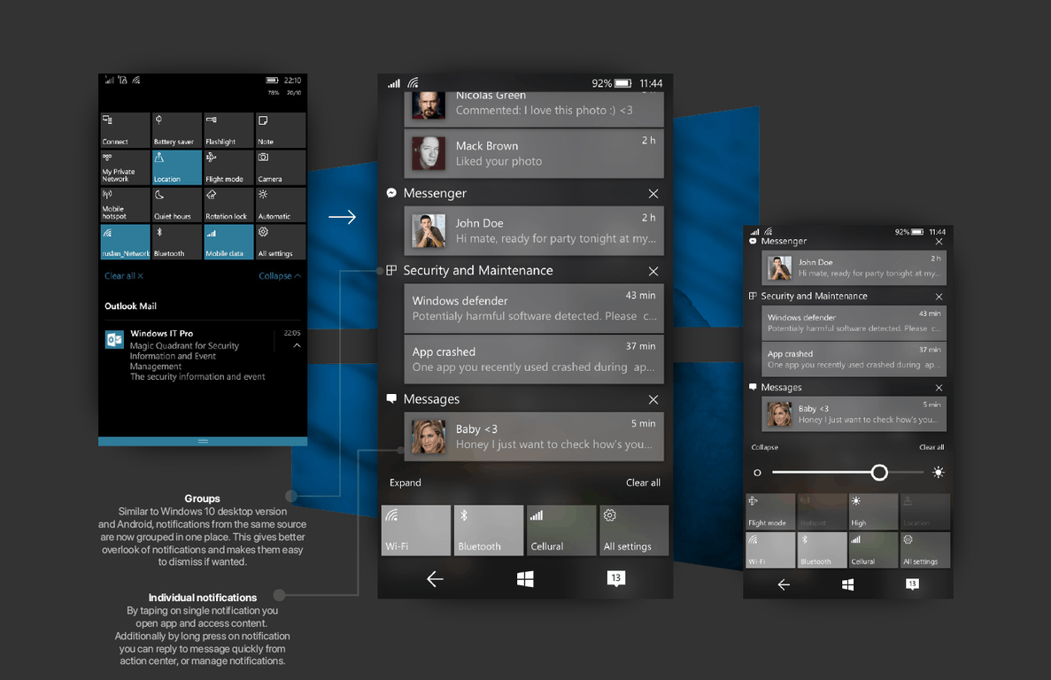
Action Center notifications are grouped into one place based on source, and you can long press on a notification to quickly reply. There are also Action Center widgets for certain apps, and a dynamic background for widgets, similar to Andriod Oreo.
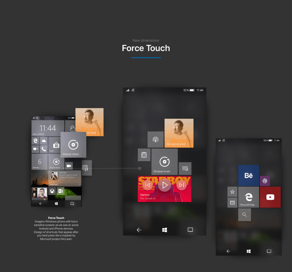
Perhaps the most significant part of this concept is support for force touch, which never made it to Windows 10 Mobile despite being in development. Malinović mentions that this feature brings “new dimensions” in Windows 10 Mobile, showing off how you can force touch to create shortcuts and more.
Other parts of Malinović’s concept show off a cleaner All Apps list and new ways of multitasking. These are definitely some cool ideas that many likely wish would have seen the light of day. Feel free to check out the full concept on Behance and let us know your thoughts in the comments section below.


