After a couple of weeks of testing with Windows Insiders, Microsoft has started to roll out a redesigned People app to all Windows 10 users. The app looks quite different compared to the previous version, even though the hamburger menu is still there with new buttons for adding new contacts and filter your contact list. Acrylic transparency effects are absent in this latest version, and we’ll see if they make a come back in a future release.
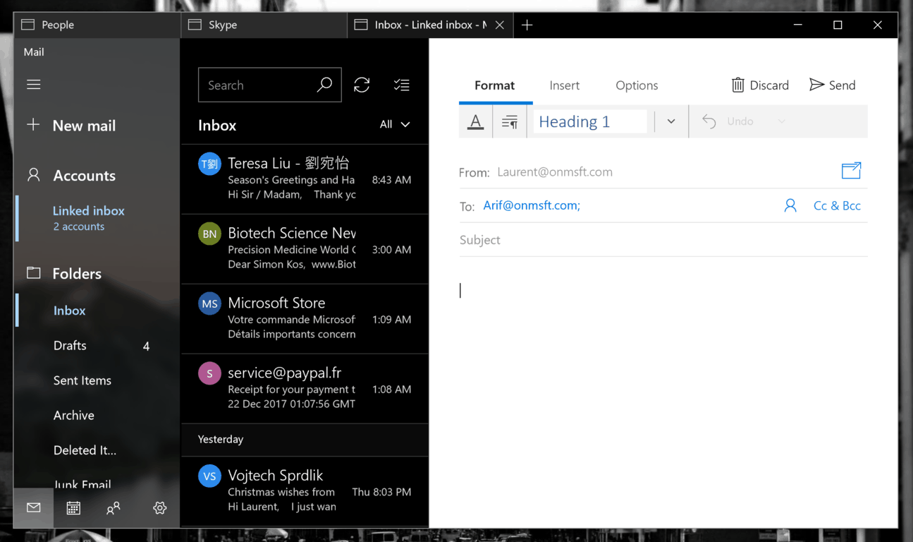
With the new UI, the contact cards now have different sections for contact details, recent conversations upcoming events and more. While testing this app on the Windows 10 Insider build 17063 with Windows Sets enabled, we noticed that clicking on a recent email conversation or the email address of one your contacts will automatically launch the Outlook Mail app in a new tab. Similarly, clicking on a phone number in a profile card will open the Skype UWP app and automatically start the call. This is quite interesting considering that for now, Windows Sets only allows Insiders to open web tabs (and not app tabs) in UWP apps.
Sets probably won’t make it to the upcoming Redstone 4 update, but the more we use the feature, the more we find something to like about it. For non-Insiders, there are still shortcuts to the Outlook Mail and Calendar apps in the left sidebar of the People app.
Do you think this redesigned People app in an improvement over the previous version, or do you think its design should be more consistent with other Windows 10 stock apps from Microsoft? Sound off in the comments below.


