Last week at Build 2017, Microsoft’s Joe Belfiore officially introduced Project Neon, the new design language for Windows 10 apps which is officially called the Fluent Design System. Over the past few weeks, we’ve seen the Fluent Design elements pop up in pop up in several native Windows 10 apps such as Groove Music, Movies & TV, Contacts and Calculator, but it wasn’t clear if the new design language would also show up on Windows 10 Mobile.
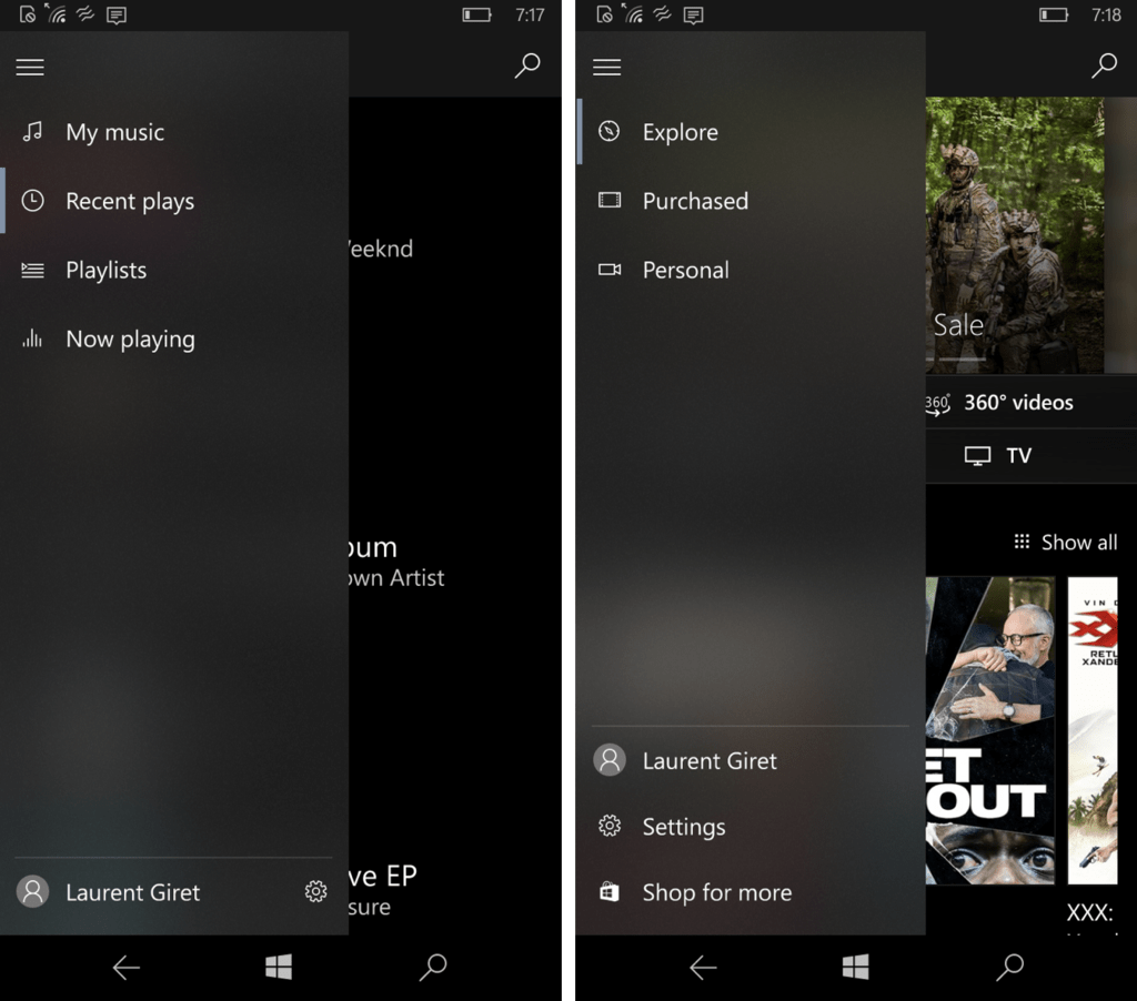
Fortunately, recent updates to the Groove and Movies & TV app showed that the cool blurring and transparency effects are also coming to Microsoft’s mobile OS. If you’re a Fast Ring Insider, you may have spotted that the versions 10.17042.12812.0 of the apps have received the Fluent Design treatment, though the transparency effects are only visible in some areas like the hamburger menu. You can see how it looks in the screenshots below:
It’s worth noting that the subtle touch of transparency adds not so subtle lags on low-end handsets such as the Lumia 550 and 650: this can be seen when the hamburger menu slides out from the left, or when you just try to scroll on the transparent area of the menu. You shouldn’t have any issues on a high-end handsets though.
We’ll let you know if we see other Windows 10 Mobile apps getting Fluent Design elements in the near future. Windows 10 may get all the love these days, but it’s nice to see that the new design language will also make its way to the mobile OS in the near future.


