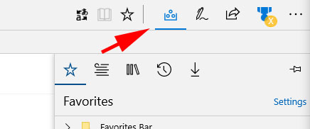
Recently, back with build 15031, I noticed a new icon in Edge, for the Hub (the one that opens to switch between Favorites, Reading List, Books, History and Downloads), which has persisted into build 15042. Apparently I’m not the only one, and not only that, the new icon I’m seeing isn’t the only one being tested.
For a refresher, this is the icon that’s been current since Edge was released with Windows 10:
However, what I’ve been seeing since 15031 looks like this:

Pretty interesting, but to be honest, neither one of them (or the original, for that matter) really does it for me, I’m not thrilled with any of the icon choices.
However, an anonymous tip just came through showing off another alternative, this one supposedly from an upcoming build:
This one, out of all of them, seems to make the most sense, as it at least gives you an indication of where to look for your Favorites, which is what most users will be doing most of the time. And of course, in IE, clicking on a Star opens the Favorites Bar, something that inexplicably changed in Edge, where clicking on the star adds a favorite, but you have had to (up until now, anyway) click on the 3 horizontal lines to get to your favorites, which has been a bit of a jarring change.
What icons are you seeing for opening the “Favorites Hub”? Which one do you like best? Let us know in the comments below!


