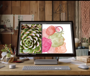
Watch Microsoft talk about the design of the Surface Studio

Microsoft has been busy showing off its new Surface Studio device, a device that we affirm is a competitor to Apple’s iMac lineup. It is specifically geared towards designers, with its Surface Dial accessory allowing intricate control, moreso than the standard keyboard and mouse setup we’re accustomed to these days.
The company has been uploading several videos to its Microsoft Store channel on YouTube, showing off what makes up the design of the Surface Studio.
The hinge
People at the company involved in the creation of the hinge for the Surface Studio talk about a few design concepts and current hinge styles that just weren’t good enough and what led to them creating the hinge that the Surface Studio now offers.
The power of the device
Having high performance, particularly for designers, is a must. Being able to load Photoshop quickly, render videos in a somewhat timely fashion and more, are all parts of needing high performance. The team behind Surface talk about how they’re packing performance into a tiny box.
Surface Dial
Microsoft created an all-new accessory for the Surface Studio – named the Surface Dial. It aims to allow for intricate design control and compliments the device’s screen perfectly. The team talk about concepts for an additional accessory and how they managed end up with a dial-like shape.
What you see is what you get
Being able to design something and see the exact end result is something that is usually only dreamed of. Usually, the final product can look quite different. The team talk about how the Surface Studio delivers “what you see is what you get.”
Love it. It’s fun
Panos Panay talks about how the Surface Studio is “fun” and the hinge made him want to “cry” because of the feeling of pulling something closer.
Let us know what you think of the Surface Studio. Have you been lucky enough to try one? Did it make you want to cry?
Further reading: Microsoft, Panos Panay, Surface Studio


What do you think of the Surface Studio?