Daily Mail for Windows 10 gets a face lift in version 2.0
\
\
\
 \
\
\
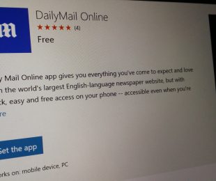
DailyMail released its Windows 10 app quite a while ago, and it looked a whole lot different than it does now. The app used to look like a newspaper – something like the New York Times website. While it was designed competently enough, it didn’t really fit the site’s content matter all that well.
\
The new redesign of the DailyMail app makes it look a whole lot different and injects a ton of color and style into something that was previously devoid of both. The new update gives the entire website a brand new look and feel, offering users something that might better strike their fancy when they go to read an article on the DailyMail.
\
If you were previously put off by the design of DailyMail but want to check out a few articles, now seems like the perfect time to give the site another chance.
\

\
 \
\
\
\
\
\


\
\
\
\
\
\
\
Further reading: DailyMail, Microsoft, Windows 10
\
\
\
\
\
\
\\t
\
\
\
\
\\t
Read these stories next
\
 \\t
\\t\
 \\t
\\t\
\
 \\t
\\t\
Windows 10 Mobile build 15025 introduces full-color updated emoji in Microsoft Edge\
\
\
\
 \\t
\\t\
\
 \\t
\\t\
 \\t
\\t\
 \\t
\\t\
 \\t
\\t\
\
\
\
\
\


Do you prefer this DailyMail design over the last one?