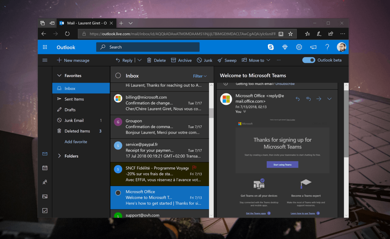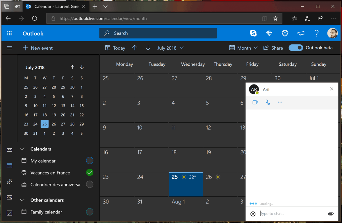
Microsoft’s redesigned Outlook.com webmail is finally getting the new Dark Mode that was teased earlier this month. You can turn it on today by opening the Quick Settings panel, and the toggle for Dark Mode should appear right under Theme selection.
For now, Dark Mode only supports the default blue theme in Outlook.com. When you turn Dark Mode on, it also gets applied to the Calendar, Contacts and Photos sections of Outlook.com, with some inconsistencies: the Contacts pane still has a white background, and it’s the same for the popups for Skype chats

While we’re still seeing the “beta” toggle on Outlook.com as of this writing, Microsoft is apparently getting ready to migrate everyone over to the new experience. “Dark Mode is available on the new Outlook.com experience (formerly known as the Outlook.com Beta experience) only,” an Outlook.com advocate wrote today on the Outlook Feedback website. Moreover, Microsoft observer Richard Hay published some screenshots of new intro screens that we’re not seeing yet, announcing that the new Outlook.com experience is no longer in beta.

Image credit: Richard Hay.
Overall, the new Dark Mode for Outlook.com is pretty nice and should be much more pleasant in low-light environnments. The lack of support for more themes is a bit disappointing, but Microsoft suggested that they’re working on it. Let us know what you think of this new Dark Mode in the comments below.
Further reading: Dark Mode, Outlook.com


