Today, Microsoft released a new Windows Insider build, 14328, of Windows 10, featuring a number of improvements to the look and feel of the new Anniversary Update improvements to the operating system. One of those improvements is a newly revamped Start Menu, incorporating improvements from Windows 10 Mobile to make the Start experience a bit easier to use.
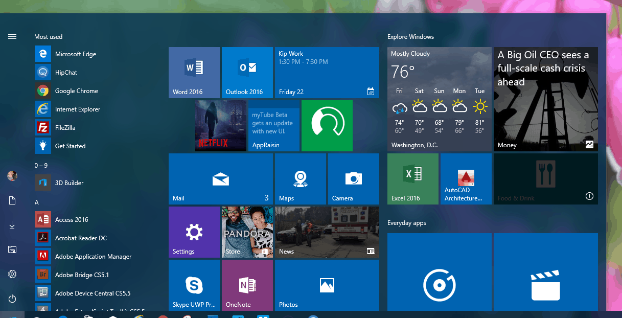
The first and most noticeable improvement comes in the list of apps in the left-hand pane (well now the middle pane), where your most used apps still appear at the top, but you no longer have to click on “all apps” to get to the rest of them. They’re just there, and you can immediately start scrolling down, or click on an alphabet heading to get to an A-Z view of your apps:

Build 14328 Start Menu
The new build also includes a new column in the Start Menu, on the far left, that includes icons for your profile, Documents, Downloads, File Explorer, Settings, and Power. These icons don’t scroll with the apps list, meaning that your access to Settings etc. is always available.
The recently added section (not shown above as I haven’t added anything recently!) has expanded from 1 to 3 items, and you can now click on it to show all of your recently added items.
It’s nice to see Microsoft listening to Insiders and tweaking the Start Menu, and Windows 10 Anniversary Update, to make it more and more useful. What do you think of the new Start Menu? Let us know in the comments below.
Editor’s note: Post has been updated, removing references to the folder feature on the Start Menu, which have been present in previous builds.
Further reading: Redstone, Start Menu, Windows 10, Windows 10 Anniversary Update


