Having spent a few days with Windows 11 on various devices, I can say confidently that my least favorite interactions come from using it on a Surface Go 2 with touch-first navigations.
Tablet mode on Windows 11, at the release of this build, is broke, but still promising.
When Windows 11 was in its theoretical incubation period and just the culmination of feedback and Insider wishes, it was heralded as Microsoft’s return to tablet-oriented development for many.
Conditions for navigating a touch-first operating system have changed since the introduction of Windows 8. When Microsoft rolled out Windows 8, it’s partners initially rolled out Windows 7 hardware retrofitted for use with Windows 8. The large touch points, bottom positioned browser URL, slide-in charms bar and the drag and drop windowing was lost on millions initially.

By the time enough touch panel devices were in the market, Microsoft had already begun the retooling of the OS and eventual backtracking development that would become Windows 10.
Many expected Microsoft to put a renewed effort into the touch-first utility of its next operating system now that it has seeded the market with millions of copies of its operating system paired with touch panels and even its own flagship hardware.
If the future of operating systems are an amalgamation of pointer, touch and voice navigation, Microsoft is already behind the eight ball for two of the three interactions. To make matters worse, what little development and developer interest the company incurred for the touch-first portion of its operating system appears to be severely deprecated as presented in this (unofficially leaked) version of Windows 11.
Understanding that this is a leaked and undoubtedly unfinished version of Windows 11, it should still be pointed out that the bare minimum touch development that was held in Windows 10 has been carved out of this build, begging the question, where is Windows 11 going with tablet support.
Windows 10 has remnants of Windows 8’s fated tablet-focused utility but it’s been arguably water down to the point of annoyance for some who were spoiled by the misguided all-in nature of the prior operating system.
Whatever the personal feelings are of its implementation, Windows 10 at least kept relatively large touch targets, similar gesture navigations and single app-focused presentations as well gesture-based windows management.

Unfortunately, Windows 11 does away with much of that while relying heavily on convoluted, unintuitive and seemingly hidden gesturing to power its “touch-first” portion of its upcoming operating experience.
Again, I will reiterate that I understand that this is an unfinished build of Windows 11 and that we’re at the beginning of what is going to be a “multi-year” evolution of the operating system, but if Microsoft is known for anything, it’s layering design and functionality atop of already existing design and functionality. For Windows 11 to start off with the removal of basic Windows 10 tablet features looks and feels very ominous of the development of Windows 11.

Off the bat, the first thing to note is that single app mode (the premier tablet feature of Windows 10) is not here or working in Windows 11. Instead of apps automatically spanning the length and width of the screen, they remain in their desktop sized form, leaving it to the user to resize the windows manually.
A convenience of Windows 10 tablet mode was that the operating system shifted (ever so slightly) to invite and prompt touch interactions immediately. Not the case in Windows 11, yet.
Secondly, while the swipe-from-the-right still brings in the Action Center, its counterpart on the left has been altered in less intuitive and intrusive way. Instead of getting the desktop overview, users will now get the widgets panel. Which is not only jarring for a lot of people who aren’t buying into the News and Weather panel, but simply less productive.
In Windows 11, as of now, the desktop overview has been relegated to an icon in the taskbar which can immediately force people with smaller hands to reposition their device to navigate their opened apps and windows.
Third, Microsoft’s rush to unify the experience between desktop and tablet modes for a seemingly intuitive one-stop shop navigation structure, has limited the customization and flexibility of touch interactions in Windows 11.
No longer can users dictate how the task bar operates between the various modes. As the scaling ramps up in size to accommodate touch targets, some users may find themselves hiding the taskbar to optimize visible real estate.
In Windows 11, the taskbar is unified in its appearance for both desktop and tablet-mode. To hide the taskbar in tablet mode means also hiding it in desktop usage as well. No longer is the operating system smart enough to calculate the circumstances of attached hardware or device positioning to present the more appropriate interaction paradigm.
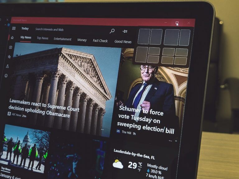
Fourth, Microsoft introduced new prompts for windowing in Windows 11 that are beautifully intuitive. Unfortunately, none of that works in Windows 11 just year.

Perhaps, it’s simply because there are only two apps that can be windowed in this mode, but the omission of the new windowing prompt in tablet mode remains a headscratcher.
Fifth, there is no easy or finger friendly way to traverse the application and programs library or penned apps like there was for Windows 10. While many still had issues with the Start Menu in Windows 10, it could double as a useful navigation interface in tablet mode.
Instead of having screen wide UI to search and navigate unpinned, sub-foldered or occasionally used applications, users are limited to the 3″ x 3″ center-task bar windows that rest annoyingly perfect between a user’s thumbs when holding a device such as the Surface Go 2. Imagine how much more inconvenient the placement will be on a larger Surface Pro device or 13.3-inch foldable.

Lastly, and perhaps, the most annoying is that the gesture-based closing of windows has been ripped out of the operating system. No longer can users drag from the top of the windows to the bottom of the screen to close an app. In Windows 11, dragging a window from the header and dragging it down to the bottom to close an app results in in app that’s difficult to re-engage with.
Instead of being able to gesture away, and close an app, users now need to finger-peck at the close buttons on windows.
Yes, the touch boxes/targets are larger in Windows 11 and offer larger buffer zones for grabbing the sides of a window to resize or close them, but the transition can be annoying for some.
Not everything is bad in tablet mode for Windows 11, and what is left is promising for some users.
As I mentioned, the touch targets offer leeway in navigation that were not in Windows 10. The precision in which users had to operate with to navigate windows was practically impossible for people with moderate to large fingers. Now there is a secondary (transparent) layer that appears allowing users to grab hold of it and resize, move and close apps.
There is also the fluidity of animations that bring Windows 11’s tablet mode more in line with iPads. Switching from portrait to landscape, is noticeably faster in transitioning positions.
In addition, there is a new portrait grouping of windows that wasn’t present in Windows 10 or even Windows 8. Users can now stack windows one-on-top of another or in other words, side-by-side multitasking in landscape retains its configurations in portrait modes. Amen!

There are also rumors of an updated Action Center that’s coming to Windows 11 that may or may not add some gesture-based utility to tablet mode and I believe there will be some Settings menus that will aid in customizing finger and gesturing down the road.
Hopefully, in a week we’ll have a clearer understanding of where Microsoft’s vision for tablet mode is headed. However, as it stands right now, tablet mode is in rougher shape than it was in Windows 10 and for many, it was already on life support.


