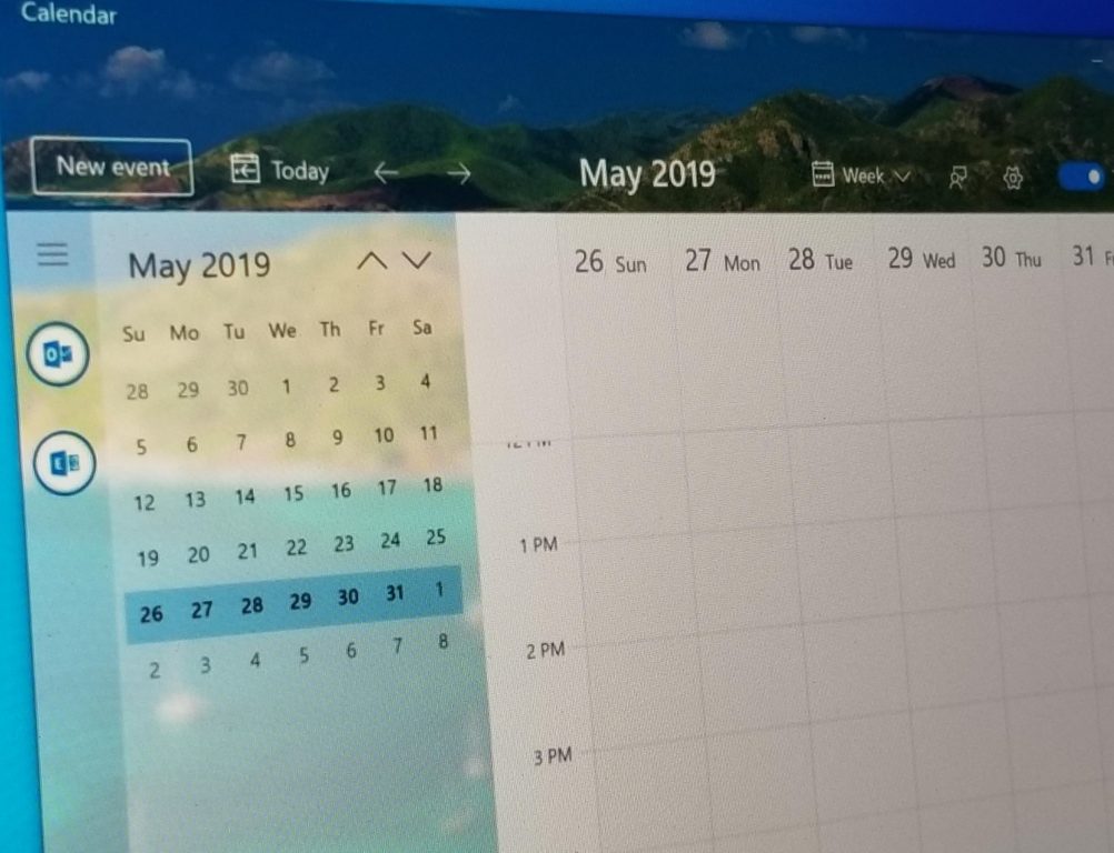
Microsoft’s efforts to evolve the design of the stock apps in Windows 10 is always ongoing, and it is now apparent that the company is also working on updating the Calendar app. Italian Blog Aggiornamenti Lumia has managed to get a preview of this improved calendar, and it looks absolutely beautiful.
Similar to the redesign of the Microsoft To Do app, it now appears as though Microsoft is putting user customization front and center with this refreshed app. The new calendar features a landscape theme by default, running along the top portions and in the background of the app. According to the report, however, Microsoft could also be working on themes for the app. Other improvements include a hamburger menu inspired by Fluent Design and a revamped Settings menu. Microsoft is also improving the event creation menu, which now appears to pop out, rather than open up in a full-screen window.


It is not clear when the public will receive this new version of the Calendar app, but Aggiornamenti Lumia reports that it is part of a “beta program.” Screenshots also show a “Try the beta” switch, so Windows Insiders, and perhaps regular Windows users could soon be able to try out this new app once it is available.
Further reading: Microsoft, Outlook Mail and Calendar, Windows 10


