Yesterday at Build 2018, Microsoft showcased the future of Fluent Design in Windows 10. As part of the session, the company detailed some changes for Fluent Design which would help developers adapt UWP apps for devices with touch screens, low resolution, and more. Known as “density,” this first Fluent Design change is now rolling out to the Windows 10 Mail app (via Neowin.)
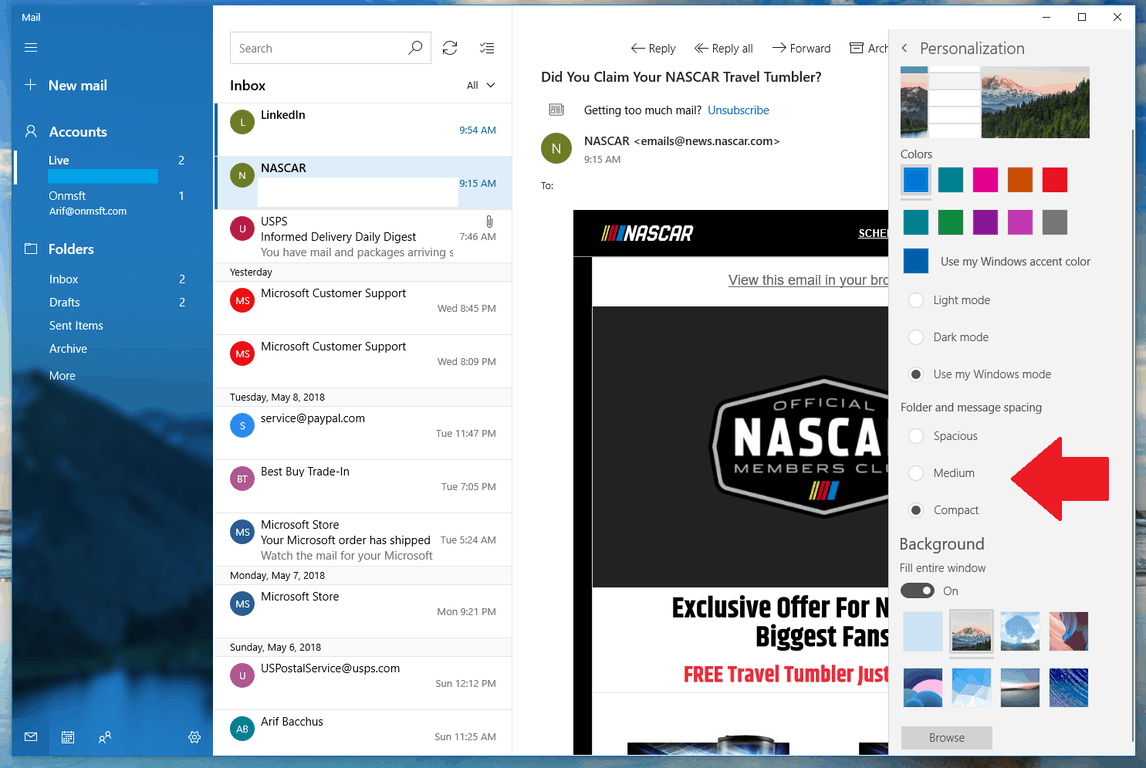
The new density option in the Mail app can be found by heading to the personalization menu in settings. Unfortunately, it’s not an automatic setting, and users need to choose from one of three options to adjust the spacing density in Mail to the type of device they’re using.
As seen in the featured image above, there are three density options to choose from— Spacious, Medium, and Compact. Each of these settings options makes the white and blank space around certain UI elements bigger and smaller. In fact, Microsoft says the settings let users can see 26% more emails when in multi-line mode and 84% more when in single-line mode.
It’s nice to see some Fluent Design changes rolling out so quickly, and those with low-resolution devices and touch screens will likely appreciate these density changes. This update is rolling out now, and you can grab it by heading to the Microsoft Store listing for Mail and Calendar below.
Further reading: Fluent Design, Mail and Calendar, Microsoft, Windows 10


