Microsoft teases another redesign for its new Skype experience, shipping soon on iOS

It’s now been three months since Microsoft started rolling out the new Skype experience to iOS and Android users, and the redesigned app has been poorly received so far. Some important features such as SMS support are still missing, and the new UI with tabs and abstract icons can also be confusing for some users.
Microsoft said early on that it was listening to feedback, and the Skype team will soon introduce another redesigned Skype app to Skype Insiders on iOS (via Thurrott.com). “We have been working on a new design of Skype for iPhone based on your feedback, and we would love to hear your thoughts,” wrote Skype insider Program Manager Ellen Kilbourne yesterday. “We are hoping it will make it easier for you to connect with the people who matter most, get things done, and enjoy a delightful experience using Skype on your iPhone.”
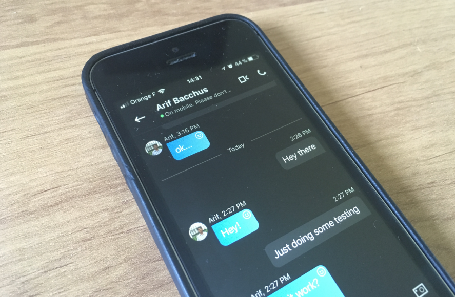
The updated version will reintroduce the bottom navigation bar, with shortcuts for chats, calls, contacts, Highlights in addition to a camera button in the middle. This new simpler look will likely please users who found the new Skype experience quite harder to navigate. Here is a summary of all the changes below:
Changes to the primary navigation
- We brought back the navigation bar which will include an easy way to access the most important functionalities of the app – chats, calls, capture, highlights and contacts
- We added numeric badges in the navigation bar for chats, calls, and highlights
- Your selected color directly affects the navigation bar
- We separated the notification screen which can be accessed by tapping the bell icon on the chats, calls, highlights, and contacts screens
- Tapping your avatar on the top bar opens your profile directly
- Settings can be found in the profile screen on the top right
- We reduced the size of the search bar to increase the number of message you can see at once
Changes to the chat screen & message composer
- Chat headers are reduced in size to increase the number of messages you can see at once
- Chat headers have presence indicators
- The compose bar was redesigned
- You can use the plus button on the bottom left to easily add things to your chat like photos, your location, money, and one of the many add-ins
- Emoticons and emojis are combined for easier access

A new look for Skype
The Skype Insider Program Manager said that the new UX will be available in version 8.7.76.54000+, but we don’t see it yet on our iOS devices (the latest Insider version is 8.7.76.59582, released on September 23). It’s not clear if this new design will eventually make its way to Android as well as Windows, macOS, and Linux, but it would certainly make sense to have a consistent experience on all platforms where Skype is available.
Further reading: Microsoft, Skype, Skype for iOS, Skype Insiders


Do you like the redesigned Skype app?