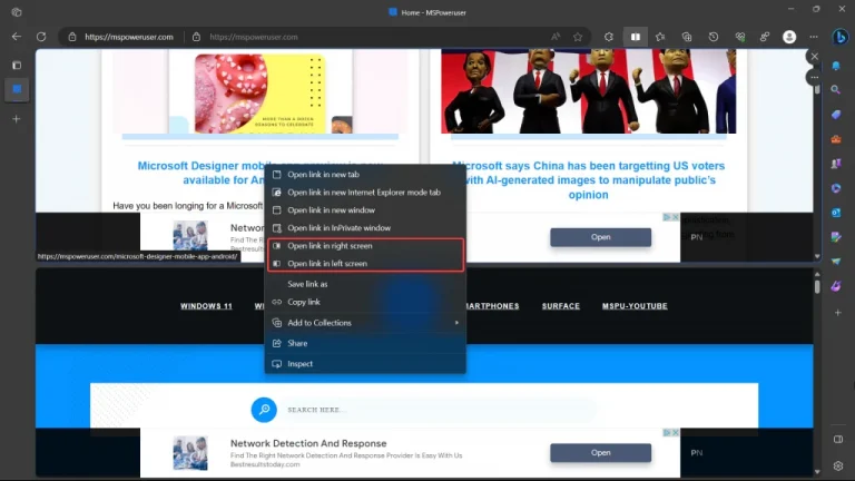
Microsoft has introduced a new layout for the Split Screen feature in the latest Canary Channel relese. This enhancement, which offers a vertical layout in addition to the existing horizontal layout, is likely to provide users with more flexibility in managing and viewing multiple websites simultaneously.
@Leopeva64 noted it on X.
Microsoft has added a new "Vertical view" to Edge's Split screen feature (Canary):https://t.co/HFp06U25OD
.https://t.co/rkrOtrPUQO pic.twitter.com/3Q3KMIHZWN— Leopeva64 (@Leopeva64) September 10, 2023
The ability to select between horizontal and vertical layouts, switch between them on the go, and resize the split screen with a divider will likely make multitasking and organizing web content more efficient and user-friendly.
Adding options in the “More option” menu to choose whether links open in the secondary tab or the current one, along with graphics to clarify the behavior of each option, is a thoughtful quality-of-life improvement. This feature should make it easier for users to control how they navigate between different web pages when using the Split Screen feature.
However, even when the view is vertical, the options are still “right” and “left,” which can be confusing. Microsoft should change this to clarify which screen the link will open on.

Overall, these updates will likely enhance the user experience and make Edge a more competitive browser in the market.
via Neowin


