This design makes Windows 10 Mobile absolutely beautiful

Yet another Windows 10 Mobile concept is making rounds on the internet, right on schedule with the next big release of Windows 10 codenamed ‘Redstone’. “Don’t we have enough of these already?” you may already be grumbling, and it’s okay, I understand: it’s Monday. Nevertheless, this new concept, from Brazilian designer Robson Jobs, seems to have really got it in all the right places, and dare I say, one of the best that have come out so far. Definitely worth checking it out, which is what we’re going to do.
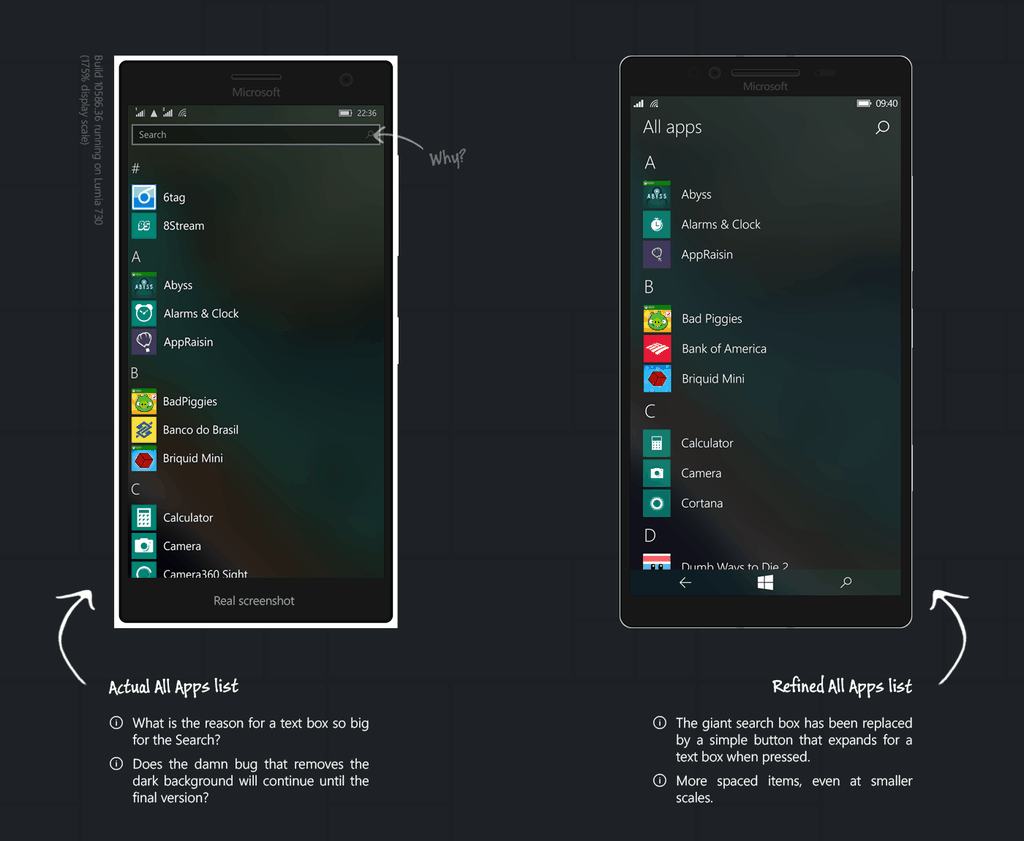
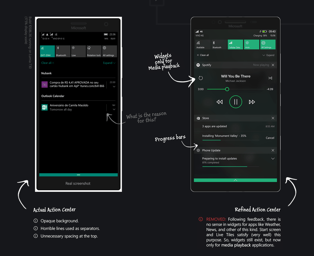
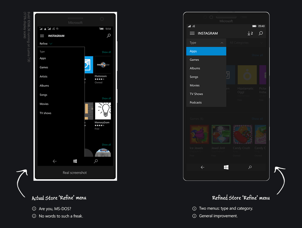
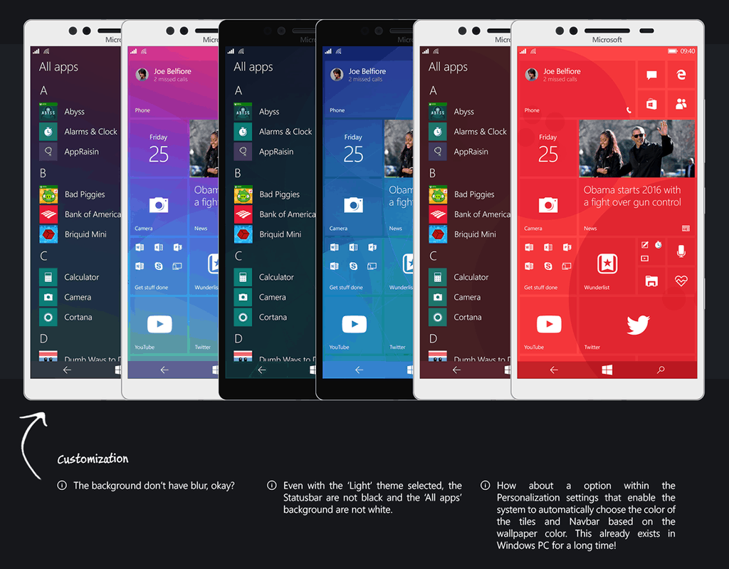
Jobs’ name may be familiar to some of you, as he also made another internet-famous concept for Windows 10 Mobile. In fact, this new concept is an evolution of his earlier work. The concept is named “Windows 10 Mobile: Thinking about Details,” and staying true to its names, introduce several small changes to the current Windows 10 Mobile user interface (UI) and user experience (UX). You won’t find anything radical or ground-breaking here; all are minute tweaks, some controversial, some surprisingly thoughtful. As a whole though, they make Windows 10 Mobile become surprisingly coherent, and as we all know, details and coherence has always been Microsoft’s weak point, especially when it comes to designing UI and UX. Because of the subtlety, Jobs placed the original and enhanced version side by side so we can see exactly what has been revamped.
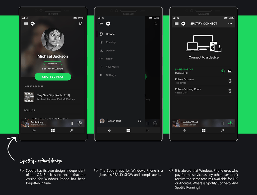
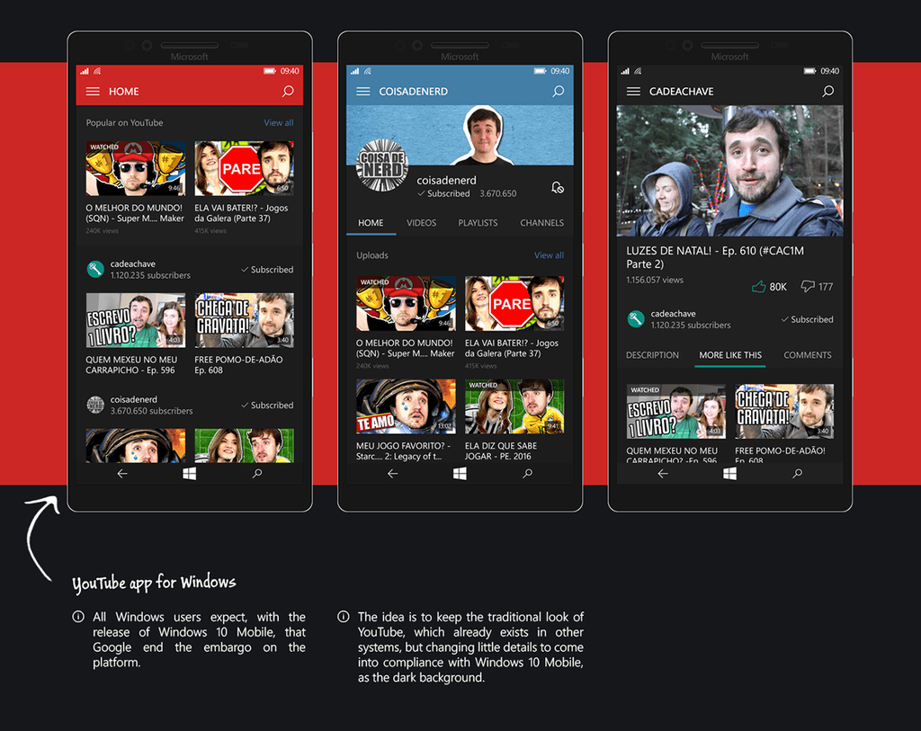
Not just content with improving on Windows 10 Mobile itself, Jobs also takes matters into his own hand and offers redesigns for two immensely popular media services, whose official Windows Phone apps are seemingly abandoned, or worse, non-existent. Yes, I’m talking about Spotify and Youtube.
Overall, this concept manages to do what all good concept does: being thoughtful about both functions and beauty to introduce plausible improvements that looks genuinely impressive. Its likeness to other popular platforms, at least in some aspects, cannot be denied; however, I fully disagree on that being a problem in and of itself, as long as the design decisions are implemented with consideration for the original canvas. Of course, since Microsoft (hopefully) should be fully aware of its OS’ shortcomings, and Redstone is still a while away, we may all be surprised when the time comes; great concepts like this only fuel our anticipation for the next big update. In the meantime though, enjoy.
Further reading: Microsoft, Robson Jobs, UI, User Interface, UX, Windows 10 Mobile






What do you think about this new concept?