In this article
\
\
\
There has been a lot of consternation among envious Microsoft reporters and fans amid Apple’s reveal of the next OS update for the Mac dubbed Big Sur at WWDC. In the wake of Apple spending a little over seven minutes covering the new design layout of the company’s latest OS update, cries rang out for Windows engineers to ready their copy machines in an attempt to satiate industry observers’ appetite for a similar awe-inspiring reveal moment from Microsoft.
\
Big Sur has launched a fleet of online conversations, debates, and frustrated commentary about how “far behind” Windows 10 is compared to macOS or relitigation of Microsoft’s tendency to overpromise and under deliver when it comes to features for its own operating system.
\
\
While I personally believe that 95% of the complaints and frustrations of Windows 10 users seeking an Apple-like cohesive experience are worthy of conversation, I think taking a step back from the hurricane-esque hype machine that is WWDC coverage may offer a bit of needed perspective.
\
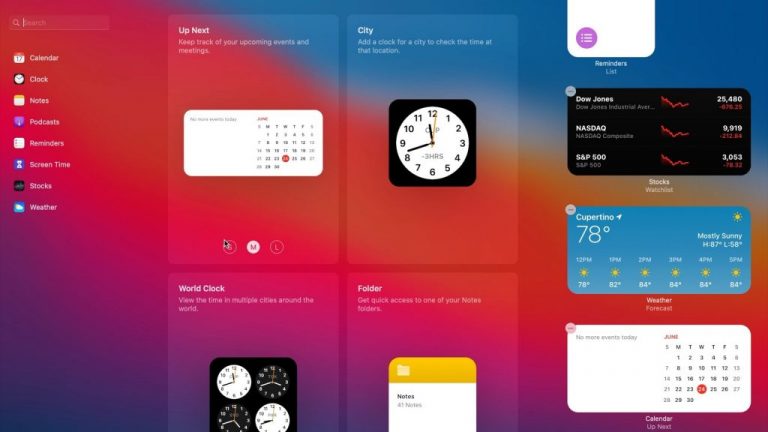
Apple got oohs and ahs for the last couple of years for ostensibly turning macOS into Windows 8.
\
\
\
macOS Big Sur isn’t that big
\
\
It may seem like a bold statement to make in the face of the endless fawning over Apple’s Big Sur reveal, but there was little in the way of functional or practical change that Apple showed last week that should impress Windows users, let alone Mac users.
\
Nothing in macOS Big Sur looks wildly different and there’s nothing to relearn, but it does offer up a clean design that’s a refreshing change of pace. –Juli Clover, MacRumors
\
After 930 words, 10 pictures and one video, even MacRumors journalists with a bit of hands-on time with Big Sur are coming to the conclusion that not much has changed. Highlights of Big Sur include translucent menu bars, “revamped battery icon”, updated Control Center, iOS widgets and icons, and new features in Safari that have been in other browsers, including the new Chromium-based Edge.
\
For all the fireworks Big Sur got this week, similar updates have been rolled out to Windows 10 over the past three years, but very few people batted an eye, wrote long-winded essays about them and even fewer encouraged macOS engineers to copy the updates at the time.
\
Putting things in perspective
\
Each year, journalists, fans, and developers get together to compare information and presentations from the big three software developer conferences that include Microsoft Build, Google I/O, and Apple’s WWDC. However, after this year’s Big Sur reveal disgruntled Windows users and developers are exemplifying the phrase “the grass is always greener” as they rake Microsoft’s Windows Insider program over the coals.
\
Without a doubt, the Windows 10 Insider program is a seemingly overly complicated mess with channels, rings, weekly updates, and unpredictable release schedules when compared to Apple’s beta program. But the Windows 10 Insider program is also a fast-moving, public mess that’s already brought several design overhauls to the platform in the span of six years.
\
To quantify the reality of Apple’s release of Big Sur, remember that this OS design update represents the first UI update to the operating system in 10 years.
\
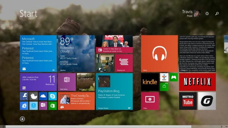
During Apple’s hibernation-like development of Big Sur, which is ultimately iOS ported to the desktop, Microsoft has delivered the Windows 8 redesign and the Windows 10 redesign.
\
\
Had Microsoft followed the cries for the euphemistic “fit and finished” production that mimics Apple’s development and release, users and developers would have to brace for the long incubation periods and years of silent correspondence regarding upcoming features or design directions. Given that reality, Windows users and developers would be getting their hands on the first iteration of Windows 10’s Modern 2.0 design language two years from now, let alone the more visually appealing Fluent design the company is currently working on.
\
Not an apples to apples development path
\
Windows 10 developers, fans, and critics should keep in mind when rousting the Insider program in light of Apple’s beta program, is that Apple has ostensibly begun using iOS and iPad OS as its “public” development channels for newer macOS features and design over the past few years.
\
Sort of like a magician, Apple has performed a sleight of hand for anyone paying attention to macOS development in a vacuum. Over the course of four years and five operating systems that include macOS Sierra, macOS High Sierra, Mojave, Catalina, and now Big Sur, Apple has addressed a handful of desktop-first/only request while burying the platform in iOS feature ports and development code.
\
In shifting desktop UI and feature development to its ancillary operating system in iOS and iPad OS, Apple has obfuscated how clean its delivery of macOS releases is in light of recent headlines such as iOS 11 the buggiest release in years or Is iOS 13 The Buggiest Version of iOS Ever?
\
Apple has for all intents and purposes, been testing what eventually becomes macOS features in plain sight at a much buggier rate on iOS.
\
Microsoft attempted to pull off what Apple is quietly implementing in macOS when the company tried to leverage its former mobile operating system to dictate the direction its desktop would go. Windows 8 was a cumulative foreshadowing of Apple’s macOS Big Sur in that design elements and features from both companies’ mobile operating systems ultimately found their way to their desktop counterparts. In addition to its early gambit with Windows 8 also attempted to learn from that operating system failures and pull back the development curtain to help people with opinions help guide the visual and functional direction of Windows 10. The end results seem to be a case of “be careful of what you wish for.”
\
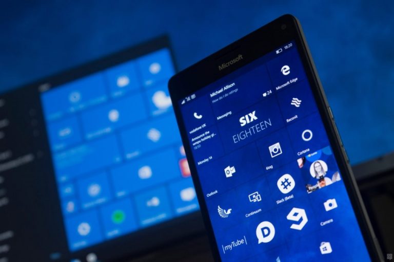
Had Microsoft not mismanaged its mobile operating system into oblivion, Windows engineers could have also used Windows 10 Mobile development and release schedules to help dictate the pace of feature releases to the desktop and perhaps offered a seemingly cleaner release of Windows each year.
\
\
Unfortunately, Microsoft no longer can lean on testing new features in Windows 10 Mobile and then porting them to Windows, so the company is left trying to implement new designs and features on the only platform Windows users are actively paying attention to. Without Windows 10 Mobile, any new feature, design change, or expansion of development tools are concentrated solely on Windows, and in turn, any bugs, dropped features, or inconsistencies that arise as the product of additional functionality are all highlighted on a single platform.
\
Windows 10 isn’t falling behind
\
For many, it may seem like Windows 10 feature development is falling behind that of macOS but taking a 30,000-foot view, it could be argued that Microsoft lept too far ahead while Apple is simply spinning its wheels and presenting them as finished laps on the desktop side.
\

\
As I mentioned, the latest macOS updates have increasingly brought iOS-centric features to the platform. With each passing iOS and now iPad update, the two platforms gain more desktop-like capabilities while the macOS then gets those features ported back to it in an iOS wrapper.
\
Beginning to see the circular nature of this development.
\
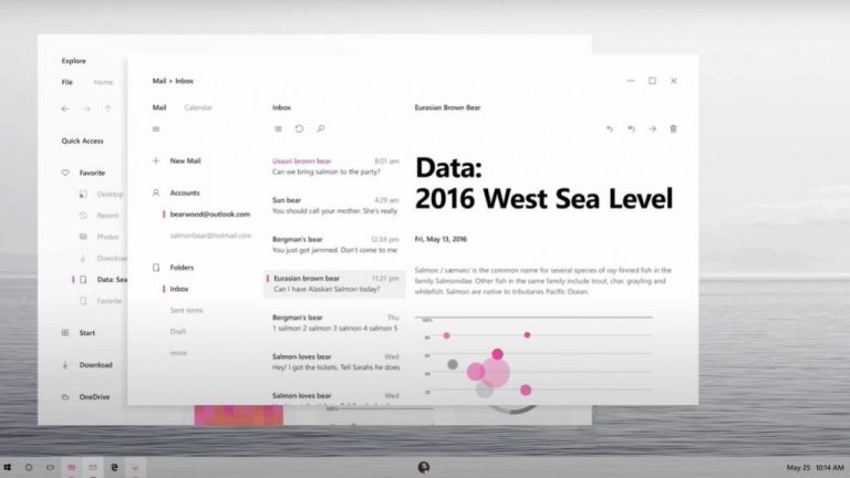
Microsoft took a major gamble with bringing mobile features and design to its desktop with Windows 8 and it didn’t work out. Now, seven years and roughly five OS updates later, Apple is receiving praise for a similar feat. Instead of recycling features such as widgets, Microsoft is looking to expand the support of ARM on its platform, bring LTE to its device line up, craft first-party experiences for progressive web apps, build support for an immersive augmented reality through Windows, merge console and desktop gaming experiences and provide a platform that supports a plethora of developer languages, all out in the open via its Insider channels. Apple may be in the labs doing the same, but it seems Microsoft is getting publicly crucified for the current shortcomings of its attempts as it works out its solutions.
\
The thread to read here is that Apple is and has always been given time to present new things, whereas, Windows hasn’t been given the same sort of leeway. Some people are claiming Windows 10 is dated and have no idea when it’s getting a new look, or that Apple’s transition to ARM is “more responsible,” but as I mentioned earlier, Windows 10 was incubated and released in half the time frame Big Sur was developed and released. In addition, Microsoft’s ARM development is also less about a transition like Apple’s and more about expanding the flexibility of its operating system to help its PC partners.
\
Yes, it would be nice to see a Fluent designed Task Manager, File Explorer or Control Panel, better yet it would be great to have all the settings in one area, but maybe we grant Microsoft the same ten-year window to “get it right”, let’s check back in sometime around 2025 to see if the OS is still a disjointed mess or if it was just time the Windows engineers needed.
\
