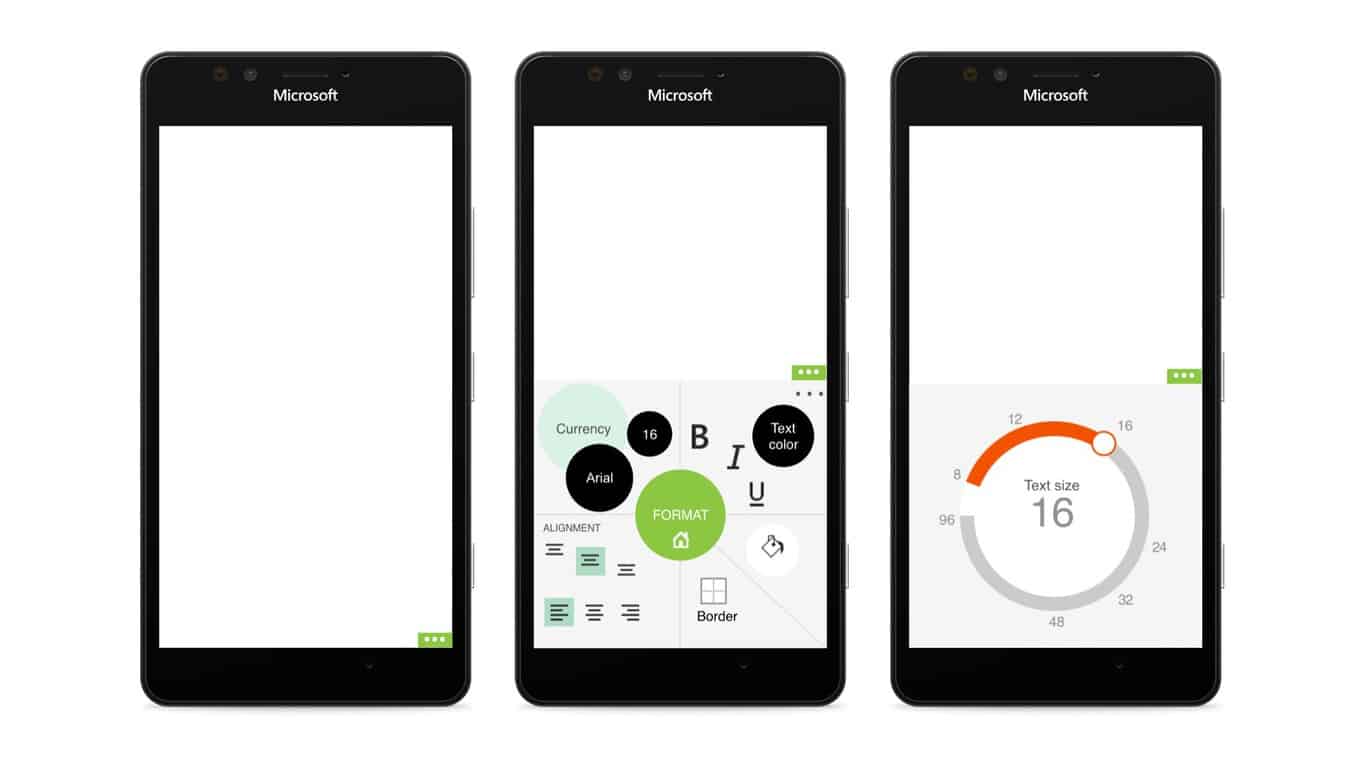
Common people like us often underappreciate the amount of work that goes into the look and feel of the software we use every day, to make it intuitive and coherent. These efforts range from difficult for simple apps to absolutely gargantuan tasks, like in the case of Microsoft’s Office Mobile, the design process for which has been documented in great detail by one of its former designers, William van Hecke (who now works for Twitter). The article, part of online design school UX Launchpad’s Design Explosion series of publications on Medium, is a very interesting but also heavy read on the design decisions that goes into mobile-izing Microsoft Office.
Office, or in this case, Word, Excel and PowerPoint, is familiar to us as the absolute standard in productivity software, and that familiarity belies the suite’s unbelievable complexity, with its myriad features, essential functions, options, and so on. Streamlining the apps and bringing them down to an intuitive design for mobile devices is not an easy task, and that’s precisely the problem Hecke’s team had to face designing the mobile version of Office for Windows Phone.
What followed were months of debate, diplomacy, and even more debates on even seemingly minute details for the core Office apps to have their current look on mobile:
“Every company that ships software struggles to find the balance between Brand vs Platform. And it’s not the kind of thing you debate once and resolve.”
The Perfect Balance
The first problem is Brand vs Platform; in other words, achieving the perfect balance between the identity of Office and the aesthetical coherence with Windows Phone, an “extremely difficult process” given how vastly different they are. The issue is even more complicated at Microsoft (at least at the time), since the company’s different divisions were still separate organizations that needed more than some smooth negotiations to work well with each other.
“It’s not the number that keeps you from great software, it’s how much incentive people have to work nicely with one another. That’s true on a two person team or across a two hundred thousand person corporation.”
Office Mobile’s designs on iOS and Android also needed to be taken into consideration, which are by themselves also very different from one another. The same was true with responsive design, given how Windows 10 Mobile promise a much more varied visual output with Continuum, and more input options with mouse, keyboard and monitor support. That’s quite a few things to consider for a two-person team, and Hecke ended up doing all the diplomacy and communication (which went up to 300 people at one point) while his teammate did the design materialization.
“In one of our first meetings, I brought the product managers together told everyone we were going to design each of our three apps on a whiteboard in 90 minutes. There was one catch: no one was allowed to design the apps they were experts in.”
The team ended up making 3 mock designs: Norma (full Windows Phone style), Tabitha (full Office style) and Solana (completely different), from which they took out elements and combined them into the final draft. There are great short clips in the original article that shows the motion study for the design on all 3 mobile OSes; unfortunately we could not embed them here. The design also needed to align with Office Mobile on Windows tablets, and here Office Mobile “earned” its design inconsistency in the menu bar positioning: it just doesn’t work being the same everywhere.
“Even Aliens Use Hamburger”
Where to put “hero options,”or the most prominent features, was the next hard question on the list, and it was at this point that the title bar, and subsequently, the hamburger menu, had to be added in after months of justification and gnashing of teeth. The File Menu just couldn’t be shoved into the bottom bar without looking clunky.
“First, you shouldn’t use a hamburger menu if you don’t have to. Second, there are plenty of cases where you need to use it, and that’s perfectly fine.” “This is not a design trend. This is not a fad. This is not art, fashion, or opinion. This is design physics. When you run out of space, you have to tuck things away or remove them.”
Hecke illustrate his point about the necessity of the hamburger button with what is probably its most hilarious defense to date: even aliens would use it if they wanted to fit uncommonly used options in a small visual space, which Office absolutely needs to do given its complexity. There are also analogies about junk drawers and oversized luggage, but let’s be serious: you just can’t argue with aliens.
The Delay
The next problem to tackle was the contextual menu, or right-click menu, or “On Object UI” as Microsoft calls it. Copy/Pasting are the elephants in the room, and the complexity of rich copy/pasting for all kinds of objects in an Office file (images, tables, slides, etc.) while also having to be coherent with system-wide copy/pasting, made it a make-or-break point for Office Mobile: in Hecke’s words, a “ship stopper.” This problem ultimately resulted in the delay of the project.
The above are just purely design problems; in fact, Hecke also talks about the many human-related difficulties involved in the process, from making sure the teams were aligned, getting through layers of management, to making hard decisions that no one wanted to take responsibility for, and the disparity between designers’ thinking world and all other parts of product making. Along his retelling of the tale, Hecke also reveals many interesting details about Microsoft’s structure and operation, like how the Android team is in India while the iOS team is a few blocks from the main building, or just how many people care deeply about Office Mobile within Microsoft (reads: a lot.)
The Conclusion
Overall, through his detailed article, Hecke presents what is, for a lack of better words, a beautiful mess that was designing Office Mobile, a big project in a huge company with a huge number of challenges. These challenges get more numerous and complicated the bigger the company, and Hecke’s article is invaluable information for any designer who intends to work on large-scale, impactful projects.
Hecke left Microsoft before Office Mobile shipped, but from his tone when he evaluates the final design of the currently available Word, Excel and PowerPoint apps, he seems satisfied with how they turned out in the end–fortunately, given how much effort he put in to make them what they are today. Thank you, Mr. Hecke, for a great mobile productivity experience.
Further reading: Android, Design, iOS, Mirosoft, Office, Office Mobile, Windows 10 Mobile, Windows Phone


