It’s been almost a year now since Microsoft unveiled Fluent Design, its new design language for Windows 10 and universal apps. Fluent Design was one of the highlights of Microsoft’s Build 2017 conference, where Microsoft showed the following video featuring beautiful mockups.
Fluent Design has since made its way to the Windows Shell and stock Windows 10 apps, but it’s still a work in progress. We usually hear about Fluent Design updates on the Windows Insider blog, but Microsoft has also created a Microsoft Design blog on Medium, where some of the company’s designers and developers share design stories.
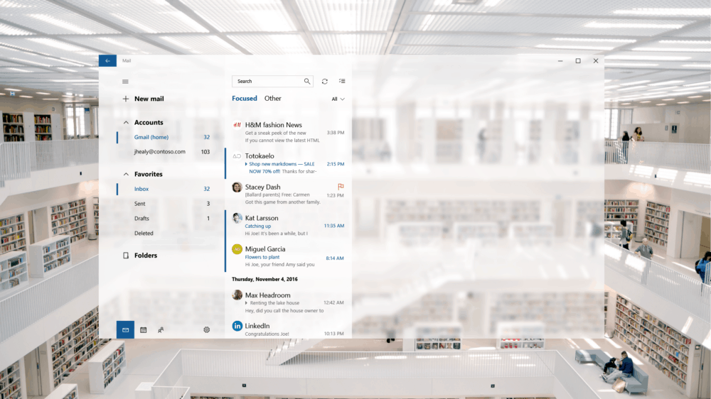
Yesterday, Ruediger Kinast, product designer at Microsoft for Outlook & Office 365 published a new blog post explaining how Fluent Design was implemented in the Windows 10 Mail and Calendar apps. It’s a pretty long and detailed piece, which includes several early mockups. Some of them look quite similar to the concept images we saw in the video from Build 2017. Here is an example below, with an early mockup with lots of transparency effects and wide panel margins.

An early concept with probably too much transparency effects.
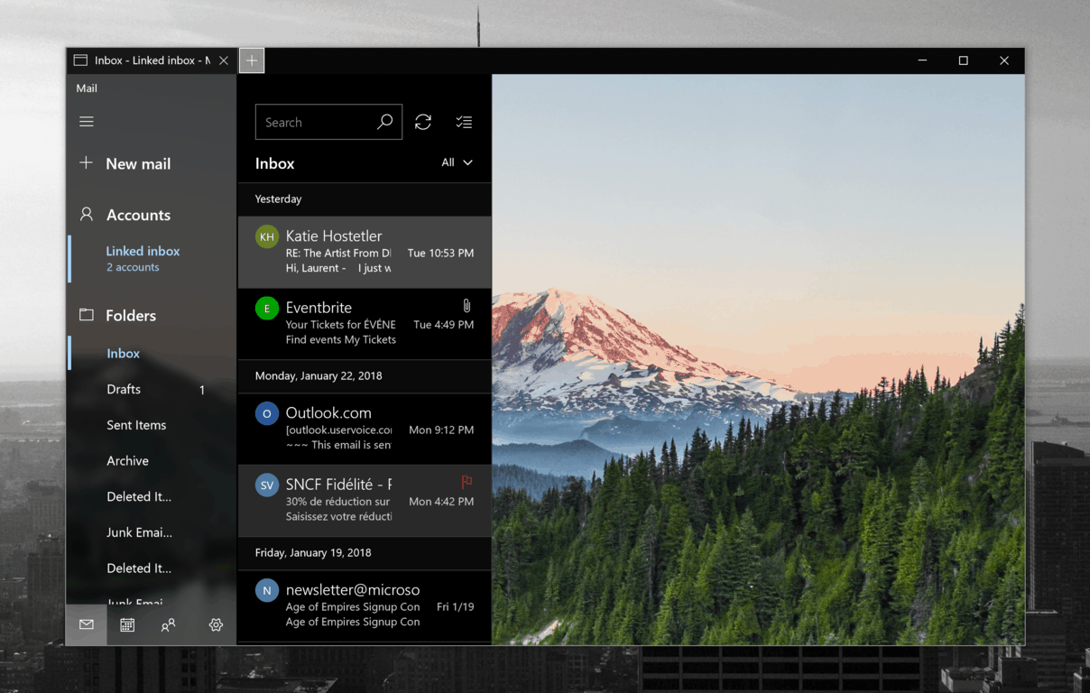
As Kinast explained in the blog post, the design team explored many ideas but eventually chose to go light on “Acrylic” transparency effects. “Ultimately, we decided in favor of the in-app background photo because we knew it delighted our users. It also reduced visual background clutter in the empty state when no email is selected,” noted Kinast.

This is how the Outlook Mail app looks today.
The Outlook Mail and Calendar apps are two of the “core” universal apps on Windows 10, and they’re probably the ones that see the most frequent updates. They’re a nice evolution of the similar “Metro” apps that first shipped on Windows 8 and Windows RT, but it’s fair to say that not everyone likes them. Power users may prefer the all-in-one Outlook desktop app over these simpler task-focused apps. Worse, some of you may think that all this Fluent Design work is just style over substance when Microsoft should just focus on bringing this app up to par with the desktop Outlook app.
For Microsoft observer and developer Yannick, this blog post showed that Microsoft designers actually struggle to consistently implement Fluent Design across Windows 10 apps. And unfortunately, it’s true that Fluent Design versions of stock apps can look very different when put next to each other.
Because honestly, there are some nice ideas in there that I’m sure off would make it just fine through testing with little to no tweaking. But we ended up with an Outlook app of which the only Fluent Design element is the nav pane and nothing else.https://t.co/gAOIeiv7je
— Yannick s384 (@Studio384) January 23, 2018
Microsoft watcher Paul Thurrott raised another interesting point: do the Windows 10 Mail and Calendar apps really need to look and function different than the other Outlook apps? “I know I’m just being cynical here, but I think it’s fair to point out that “Fluent Design” is just the 2018 version of “lipstick on a pig,” he added in a following tweet.
Great. Now start over again and make it like Outlook on Android/iOS. https://t.co/yFsdYnlkns
— Paul Thurrott (@thurrott) January 23, 2018
Microsoft previously explained that Fluent Design would roll out in waves, and we should see more of it with every major Windows 10 update. But as almost all stock Windows 10 apps are now updated through the Windows Store, it’s a bit of a mess. Yes, Microsoft can test Fluent design updates for the Windows Shell and Windows 10 apps with Windows Insiders, but consumers are not designers. Transparency effects are nice, but consumers probably care more about features and consistency.
Speaking about future updates for Outlook Mail and Calendar, Kinast said that “we’re already working on fine-tuning with information density settings, Fluent connected animations and a light theme.” The designer added that “the design will constantly improve and evolve,” which isn’t necessarily something you want from core communications apps. Do you think something is wrong with Microsoft’s implementation of Fluent Design, or are you all right with apps that constantly change? Let us know your thoughts in the comments below.
Further reading: Fluent Design, Outlook Mail and Calendar, Windows 10


